Tag

Feel

Browsing


After living in their Michigan home for about 20 years, these retirees were ready to tackle their dated, cramped kitchen, which was cut off from the dining room by a partition wall. They loved the warmth of the vaulted, stained wood ceiling but wanted a more open, functional space. They turned to designer Oliver McCarthy, who uses Houzz Pro software, for help.

McCarthy removed the partition and expanded the kitchen into the dining room, adding 180 square feet. The new layout accommodates a larger island with seating and storage. Two-tone cabinets in light mocha and earthy gray-brown add depth and maximize storage, while a few glass-front units and a wide gliding window over the farmhouse sink keep the space feeling light. Handy pullouts, a welcoming beverage nook, durable sand-colored porcelain tile flooring and sleek black appliances give the kitchen a sophisticated finish.

Before Photo

Delight Remodel & DesignSave Photo

“After” photos by Troy VanLangen of Above the Horizon Media

Kitchen of the Week
Who lives here: A retired couple
Location: Ada, Michigan
Size: 330 square feet (31 square meters)
Designer: Oliver McCarthy of Delight In Designs

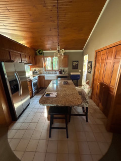
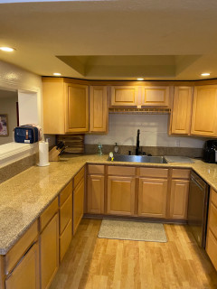
Before: The 150-square-foot kitchen, with its dark taupe walls, beige tile flooring and a vaulted stained wood ceiling, felt cramped. A long, narrow island had tight seating on two sides, and short honey oak cabinets offered limited storage. A bulky stainless steel refrigerator jutted past the cabinetry, making the footprint feel even smaller. “The kitchen felt disproportionate to the size and overall layout of the house,” McCarthy says.

The refrigerator and range sat on the wall separating the kitchen from the dining room, with a pass-through awkwardly placed above the range. “That didn’t seem very safe,” McCarthy says. A sink and short run of cabinets lined the adjacent back wall, while the wall on the right held shallow pantry closets. The doorway in the back right corner connects to the garage.

Before Photo

Delight Remodel & DesignSave Photo

This wider view from the adjoining living room shows how the partition wall closed off the kitchen from the dining room on the left. It also highlights the existing skylight the homeowners wanted to keep. “They were definitely wanting to make the kitchen bigger but weren’t sure how much bigger to go and what to do with the dining room,” McCarthy says.

Find kitchen remodelers near you

Delight Remodel & DesignSave Photo
After: McCarthy removed everything but the vaulted wood ceiling and skylight. “All the windows on that exterior wall were covered up and patched to make room for the new gliding window we added over the sink,” he says.

Taking down the partition and eliminating the formal dining room increased the size of the kitchen from 150 to 330 square feet. McCarthy says the couple used a previous addition to create a smaller dining and family area. Because most meals are now enjoyed at the new island, losing the formal dining room wasn’t a concern.

The expanded footprint allowed for a spacious island with seating and storage. Perimeter cabinets in light mocha contrast with the island’s earthy brown-gray finish. “When there’s an opportunity to do a two-tone look in this kind of large-sized space, it gives you the chance to do a more statement color for the island and go with a more neutral, timeless color on the perimeter,” McCarthy says.

A bronze-finish linear chandelier over the island coordinates with the island base and oil-rubbed bronze hardware. Tan performance leather swivel stools provide comfortable seating. A black stainless steel French door refrigerator now sits on the sink wall. “With that being the entry point from the garage, it’s a good place for them to unload groceries,” McCarthy says.

He used Houzz Pro to manage the project and create estimates.

Cabinetry: Concord 275 door style in Light Mocha (perimeter) and Urbane Bronze (island), Showplace Cabinetry; cabinetry hardware: Revitalize in oil-rubbed bronze, Amerock Hardware; stools: Russell, Amisco

See why you should hire a professional who uses Houzz Pro software

Delight Remodel & DesignSave Photo
The island and perimeter counters are a durable 3-centimeter engineered quartz with a pale ivory background and soft gray and taupe veining. The floor is covered in 12-by-24-inch sand-colored porcelain tiles with medium taupe grout. “In my experience, the lighter your grout, the quicker it’s going to get dirty,” McCarthy says. “And being a larger-format tile, we went with a ⅓ offset brick pattern that eliminates any noticeable bowing or arching in the center of the tile.”

Walls painted a muted warm white (Sanctuary by Sherwin-Williams) with creamy white trim (White Sand by Sherwin-Williams) create a light, cozy backdrop. “The creamy white we used here doesn’t have those yellow undertones that some people don’t like,” McCarthy says.

Flooring: Regency in Sand, 12 by 24 inches, Virginia Tile Co.

Shop for your kitchen

Delight Remodel & DesignSave Photo
A 30-inch black stainless steel slide-in range with five burners, convection oven and a fingerprint-resistant finish gives the couple plenty of cooking flexibility for everyday meals and busy holidays. A custom oil-rubbed bronze sloped hood with a powerful fan ties in with the room’s other dark finishes. “The details on the vertical portion of the hood tie into the rivets seen on the stools at the island,” McCarthy says.

Illuminated glass-front upper cabinets lighten the range wall and showcase finer glassware and dishes. “Since they have a ton more storage than before, we felt it was a good opportunity to have that open display,” McCarthy says.

Custom hood: Sinda Copper Co.

10 Stylish Kitchen Islands That Invite Conversation

Delight Remodel & DesignSave Photo

Pullouts on either side of the range keep essentials within reach, from canned goods to cooking tools. The pullout to the left contains a knife block and holders for utensils like ladles and spatulas, while the pullout in the foreground of this photo stores baking sheets and pans.

Delight Remodel & DesignSave Photo
A coffee station to the left of the range hides equipment and supplies behind space-saving bifold doors. The backsplash consists of 2½-by-8-inch cotton white subway tiles with a handmade look, glossy glaze and black grout. “With having black accents everywhere else, it felt like a great chance to highlight an otherwise simple tile,” McCarthy says.

Above the range, a focal-point design of matte ceramic tiles with an aged bronze finish adds texture and depth. “I felt it was a nice accent to break up the space and an opportunity to add a fun or unique element,” McCarthy says.

Tile above range: Jonathan Adler Shelter Island in Aged Bronze, Lunada Bay Tile

25 Genius Kitchen Storage Ideas

Delight Remodel & DesignSave Photo
A 33-inch white farmhouse sink includes a basin rack and sound-dampening features. It’s paired with an oil-rubbed bronze pull-down faucet with docking technology and a three-function spray head. Three 13-inch outdoor-style sconces in the same finish brighten the area.

The 8-foot-wide custom gliding window frames backyard views. Its single sash slides horizontally for full ventilation, and the quartz sill matches the counters. “They didn’t want to go with something like a casement window that tends to get dirty during rainy weather,” McCarthy says.

Sconces: Brock in oiled bronze, Capital Lighting; sink: Turino, Kraus; faucet: Bellera in oil-rubbed bronze, Kohler; window: E-Series Gliding Window, Andersen Windows + Doors

Before and After: 4 Inviting Kitchens in 120 to 160 Square Feet

Delight Remodel & DesignSave Photo
A fingerprint-resistant black stainless steel dishwasher sits to the right of the sink. A deep double pullout for trash and recycling is on the left. “There is also a blind corner cabinet there with a pivoting half-moon double shelf for storing additional canned goods and boxes of dry foods,” McCarthy says.

How to Design a Multigenerational Kitchen

Delight Remodel & DesignSave Photo
The sink side of the island features a 15-inch beverage center, a black stainless microwave drawer with a concealed control panel and multiple drawers for kitchen essentials. “Some of those drawers have a peg system for organizing dishware,” McCarthy says. At the back, a new integrated beverage nook and upgraded pantry closet complete the space.

Microwave drawer: Sharp

New to home remodeling? Learn the basics

Delight Remodel & DesignSave Photo
The beverage nook has lighted glass-front upper cabinets with oil-rubbed bronze knobs, an integrated wine rack and a quartz countertop that matches the island and perimeter counters. Lower cabinets with adjustable shelves store liquor bottles and extra glassware. The backsplash echoes the dimensional tiles above the range. “With this new kitchen, I really wanted to focus on function without sacrificing design,” McCarthy says.

More on Houzz
Read more kitchen stories
Browse kitchen photos
Hire a kitchen remodeler
Shop for kitchen products


This article was originally published by a
www.houzz.com . Read the Original article here. .


After working with this couple on several homes over the years, interior designer Jeannine Bogart knew their style and how they liked to live. So when they needed a house that could bring three generations under one roof, she was involved from the start. She even helped during the search, which led them to a 1970s French country-inspired home in Northbrook, Illinois. She was there throughout the design and renovation phases and coordinated the move once the house was ready.

At the top of the renovation list was the primary bathroom. “As a space central to our clients’ daily comfort and quality of life, it needed to reflect the overall aesthetic of their home,” Bogart says. “The budget for this room was intentionally generous, allowing us to explore a range of possibilities.” This included expanding the small shower stall and tricking it out with luxurious bells and whistles. Other highlights are a vanity that maximizes storage, heated floors and lovely custom details that personalize the space.


This article was originally published by a www.houzz.com . Read the Original article here. .


A\ TYPICAL DESIGN STUDIOSave Photo
“We wanted to give them plantings with a Mediterranean feel, but we are in Utah, after all,” Van Zandt says. “I picked ‘Autumn Brilliance’ serviceberry [Amelanchier x grandiflora ‘Autumn Brilliance’, USDA zones 4 to 9; find your zone] here because they have a similar structure to olive trees you’d see in Mediterranean landscapes.” These trees also offer year-round interest, with flowers in the spring, lovely leaves all summer, berries in the fall, and beautiful smooth gray bark and a multistemmed structure to enjoy in the winter.

Like the black-and-white fabrics Bald picked for the furniture, Van Zandt went for contrast among the plantings. The hardscape around the large raised beds is a light pea gravel. The gravel beneath the trees is darker, larger, flatter and more compacted. There is steel edging between the different gravel beds and between the gravel beds and the lawn.

A trio of concrete globe sculptures adds curves to rectilinear beds. Bald “came up with creative ideas like adding these globes, and she picked some of the planters,” Van Zandt says. “She is so creative, and it was really great to be able to see one of the landscapes I worked on completely finished like this.”

Plant These Garden Favorites for a Taste of the Mediterranean


This article was originally published by a www.houzz.com . Read the Original article here. .


Delphinium DesignSave Photo
The door on the left leads to the toilet room and the one on the right leads to a closet. Both spaces were remodeled as part of the project.

The homeowners loved the look of a slightly rugged natural stone floor. Because they also wanted low maintenance, the designer steered them toward porcelain. “As someone with a trained eye, I can usually tell the difference between natural stone and porcelain, but in this case I really can’t,” she says. “We used a wide range of color in the tiles, and they have a texture to them. There are even little faux chips in them. Also, the texture makes it slip-resistant.” Bula had the tiles laid in a classic herringbone pattern.

The wall paint, Etiquette by Benjamin Moore, is a shade Bula tested in her own home. “Before I used it, I did a bunch of blind paint color tests and I chose this color every time,” she says. “It’s a really nice warm neutral that does not lean too beige. And it looks so nice next to white trim.” The white paint is Benjamin Moore’s Simply White.


This article was originally published by a
www.houzz.com . Read the Original article here. .


This unique 1960 home in a suburb of San Antonio, Texas, was designed by architect Robert Harris for Bernard Lifshutz, a prominent San Antonio real estate developer, civil rights activist and historic preservationist. The home changed hands several times over the years, and with each renovation, the original midcentury modern features were stripped away a bit more.

The current owners, who are big fans of midcentury design, contacted Jana Valdez of Haven Design and Construction after seeing one of the company’s projects online. They wanted to improve the home’s layout, including making changes to the kitchen and primary suite, and resurrect the home’s midcentury features. “They called us pretty quickly after purchasing the house because they knew immediately that they needed a solution for the primary closets being in the main hallway of the house, and they really wanted a walk-in pantry in the kitchen,” Valdez says.


This article was originally published by a www.houzz.com . Read the Original article here. .


ME Design GroupSave Photo
After: Kikos got rid of some walls to expand the kitchen into the living room and create an open concept. That went a long way toward reducing the confining feel, adding light and making room for an 8-foot island. Kikos also walled over that pass-through to the dining room seen in the previous photo and moved the range there. So now, even though the fridge hasn’t moved, the cook has a convenient work triangle.

Other design moves to open up and brighten the space included nixing some upper cabinets, using glossy white backsplash tiles that reflect light and having a lot more white wall space plus a white island counter. The remaining cabinets, the tall pantry cabinets to the left of the fridge and the niche shelving at the alcove ends provide all the storage needed.

Backsplash tile: Cloe in white, 5 by 5 inches, Bedrosians Tile and Stone

Read more about this project


This article was originally published by a
www.houzz.com . Read the Original article here. .


This article was originally published by a
www.houzz.com . Read the Original article here. .

Pin It