
This article was originally published by a www.houzz.com . Read the Original article here. .

This article was originally published by a www.houzz.com . Read the Original article here. .

House at a Glance
Who lives here: A couple with five children between them
Location: Var region, Provence, France
Size: Five bedrooms and four bathrooms on three floors
Designers: Stephanie Bailey and Jo Miller of Decorbuddi
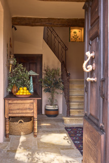
The owner bought this former olive farm in 2024 as a place he and his wife could share with friends and extended family. He wanted a warm and livable design, with sustainable choices throughout and a “wow” moment here and there. “He didn’t want anything so precious that if he broke it, he would be weeping,” Bailey says.
The owner loves Moroccan style, but has worked all over the world. “He’s lived in India, Sri Lanka and Nepal and is really well traveled,” Bailey says. “He has lovely textiles, amazing bold colors and a lifetime’s collection of interesting art and objects in his London house. When Jo and I were presenting mood boards to him there, we saw it and were like, OK, we get what he likes.”
Miller agrees. “To start with, the owner wanted Moroccan and he wanted color, but we swiftly realized he wanted a world look,” she says. “The challenge was to offer him that kind of aesthetic, but to incorporate it within a French farmhouse.”
The walls in the hall and landing are painted a warm pinky beige shade. “We wanted it to be really ambient and a bit moody in there, and we knew we had good lighting going in that this tone would work with,” Bailey says.
Miller sourced the old table in France. “We had to have it cut down or it wouldn’t have fitted here,” she says. “It was more like a table than a console originally.”
Hall and landing wall paint: Leather V, Paint & Paper Library; table: Pamono
This article was originally published by a www.houzz.com . Read the Original article here. .

“Kitchens in 1883 would not have had built-in cabinetry as we know it today,” McCarley says. “Instead, they relied on freestanding tables, plate racks and wall-hung shelving. We echoed this tradition through using open shelving, custom plate racks and a stunning mahogany island.”
The homeowner found the local craftsman, Dale Peel, who built the island and all of the cabinets. They kept as much of the original trim and moldings as they could, and Peel matched them as needed.
The home’s narrow doors posed a challenge once again when the island was delivered, however. “They couldn’t get the island in the house, either,” McCarley says. “We had to take it back home and take all the legs off, bring in the top, bring the legs in separate and put it together!”
Paint: Pale Oak (cabinets) and Wythe Blue (trim), Benjamin Moore
This article was originally published by a www.houzz.com . Read the Original article here. .
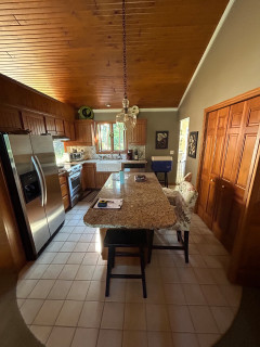
After living in their Michigan home for about 20 years, these retirees were ready to tackle their dated, cramped kitchen, which was cut off from the dining room by a partition wall. They loved the warmth of the vaulted, stained wood ceiling but wanted a more open, functional space. They turned to designer Oliver McCarthy, who uses Houzz Pro software, for help.
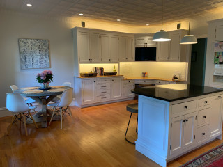
McCarthy removed the partition and expanded the kitchen into the dining room, adding 180 square feet. The new layout accommodates a larger island with seating and storage. Two-tone cabinets in light mocha and earthy gray-brown add depth and maximize storage, while a few glass-front units and a wide gliding window over the farmhouse sink keep the space feeling light. Handy pullouts, a welcoming beverage nook, durable sand-colored porcelain tile flooring and sleek black appliances give the kitchen a sophisticated finish.
Before Photo
Kitchen of the Week
Who lives here: A retired couple
Location: Ada, Michigan
Size: 330 square feet (31 square meters)
Designer: Oliver McCarthy of Delight In Designs
Before: The 150-square-foot kitchen, with its dark taupe walls, beige tile flooring and a vaulted stained wood ceiling, felt cramped. A long, narrow island had tight seating on two sides, and short honey oak cabinets offered limited storage. A bulky stainless steel refrigerator jutted past the cabinetry, making the footprint feel even smaller. “The kitchen felt disproportionate to the size and overall layout of the house,” McCarthy says.
The refrigerator and range sat on the wall separating the kitchen from the dining room, with a pass-through awkwardly placed above the range. “That didn’t seem very safe,” McCarthy says. A sink and short run of cabinets lined the adjacent back wall, while the wall on the right held shallow pantry closets. The doorway in the back right corner connects to the garage.
Before Photo
Find kitchen remodelers near you
Taking down the partition and eliminating the formal dining room increased the size of the kitchen from 150 to 330 square feet. McCarthy says the couple used a previous addition to create a smaller dining and family area. Because most meals are now enjoyed at the new island, losing the formal dining room wasn’t a concern.
The expanded footprint allowed for a spacious island with seating and storage. Perimeter cabinets in light mocha contrast with the island’s earthy brown-gray finish. “When there’s an opportunity to do a two-tone look in this kind of large-sized space, it gives you the chance to do a more statement color for the island and go with a more neutral, timeless color on the perimeter,” McCarthy says.
A bronze-finish linear chandelier over the island coordinates with the island base and oil-rubbed bronze hardware. Tan performance leather swivel stools provide comfortable seating. A black stainless steel French door refrigerator now sits on the sink wall. “With that being the entry point from the garage, it’s a good place for them to unload groceries,” McCarthy says.
He used Houzz Pro to manage the project and create estimates.
Cabinetry: Concord 275 door style in Light Mocha (perimeter) and Urbane Bronze (island), Showplace Cabinetry; cabinetry hardware: Revitalize in oil-rubbed bronze, Amerock Hardware; stools: Russell, Amisco
See why you should hire a professional who uses Houzz Pro software
Walls painted a muted warm white (Sanctuary by Sherwin-Williams) with creamy white trim (White Sand by Sherwin-Williams) create a light, cozy backdrop. “The creamy white we used here doesn’t have those yellow undertones that some people don’t like,” McCarthy says.
Flooring: Regency in Sand, 12 by 24 inches, Virginia Tile Co.
Shop for your kitchen
Illuminated glass-front upper cabinets lighten the range wall and showcase finer glassware and dishes. “Since they have a ton more storage than before, we felt it was a good opportunity to have that open display,” McCarthy says.
Custom hood: Sinda Copper Co.
10 Stylish Kitchen Islands That Invite Conversation
Pullouts on either side of the range keep essentials within reach, from canned goods to cooking tools. The pullout to the left contains a knife block and holders for utensils like ladles and spatulas, while the pullout in the foreground of this photo stores baking sheets and pans.
Above the range, a focal-point design of matte ceramic tiles with an aged bronze finish adds texture and depth. “I felt it was a nice accent to break up the space and an opportunity to add a fun or unique element,” McCarthy says.
Tile above range: Jonathan Adler Shelter Island in Aged Bronze, Lunada Bay Tile
25 Genius Kitchen Storage Ideas
The 8-foot-wide custom gliding window frames backyard views. Its single sash slides horizontally for full ventilation, and the quartz sill matches the counters. “They didn’t want to go with something like a casement window that tends to get dirty during rainy weather,” McCarthy says.
Sconces: Brock in oiled bronze, Capital Lighting; sink: Turino, Kraus; faucet: Bellera in oil-rubbed bronze, Kohler; window: E-Series Gliding Window, Andersen Windows + Doors
Before and After: 4 Inviting Kitchens in 120 to 160 Square Feet
How to Design a Multigenerational Kitchen
Microwave drawer: Sharp
New to home remodeling? Learn the basics
More on Houzz
Read more kitchen stories
Browse kitchen photos
Hire a kitchen remodeler
Shop for kitchen products
This article was originally published by a www.houzz.com . Read the Original article here. .
The existing kitchen was generously sized but had a lot of wasted space. For the new layout, Barber considered things like improving the traffic flow between rooms, accommodating gatherings and creating a way for the young children who live here to grab drinks and snacks in a spot outside the work triangle. She aimed to blend modern conveniences with traditional elements, and she did so skillfully, giving the kitchen what she calls “mood and soul.”
This article was originally published by a www.houzz.com . Read the Original article here. .

An 11-by-3½-foot island serves as the center of the kitchen and its English-kitchen-inspired green paint, marble countertop with an ogee edge and oversize glass pendant lights make it stand out. The seeded glass and knurled brass on the lights add texture and dimension, while their transparency keeps them from overwhelming the space. “I’d always rather have lights be oversized than anything that looks the slightest bit undersized,” Wunder says.
Beyond the island, a range alcove serves as the focal point. The range hood has a subtle curve to it and is flanked by countertop cabinets that provide storage for everyday dishes and glassware.
The homeowners wanted a scullery, or back kitchen, to hold additional prep space, the fridge, a second sink and dishwasher for hiding pots and pans when entertaining, small appliances, a second oven and storage for pantry items, wine, glassware, serving pieces and more. “The main kitchen laid out really nicely because we knew how much the back kitchen would be supporting it,” Wunder says. “It allowed the kitchen to become more of an entertaining kitchen.”
Find an interior designer on Houzz