This article was originally published by a www.houzz.com . Read the Original article here. .
![]()
Designer: Chelsea Ayres Interiors
Location: Athens, New York
Size: 464 square feet (43 square meters); 16 by 29 feet
Homeowners’ request. “This home is perched right on the lake, and my clients wanted this lower-level living area to feel like a true extension of the water, a place where family and friends could gather year-round to relax, play games and soak up that serene lakeside vibe,” designer Chelsea Ayres says. “Our goal was to layer warmth and personality while staying true to the home’s natural setting. By introducing texture, color and thoughtful seating arrangements, we were able to transform it into a welcoming hub that feels distinctly ‘them.’”
Special features. “With such a long and narrow space, the layout called for a few separate seating areas, which we unified by wrapping the walls as well as the ceiling in Benjamin Moore Collingwood (a warm gray), creating a cohesive cozy space that disguises the low basement ceilings,” Ayres says. “Keeping things warm and cozy was also attained by careful selection of materials for furnishings. Leaning into sumptuous velvet in a rich, deep lagoon color for the accent chairs, along with a substantial wood coffee table to ground the space and ottomans made from wool to mimic lakeside stones, we struck a balance of both nature-inspired pieces that were also inviting and warm.”
A rich cognac leather sofa brings warmth to the space, while a wet bar and additional seating area anchor the opposite side of the room.
Designer tip. “Don’t be afraid to segment your seating areas in large or oddly shaped spaces,” Ayres says. “Allowing for smaller seating arrangements offers a more intimate vibe in what can otherwise feel like an overwhelming space. If you are trying to create a room where people will truly connect, you need to keep the seating arrangements smaller and clustered around tables, especially around round tables if you can. It allows for much better conversation and inclusion.”
New to home remodeling? Learn the basics
This article was originally published by a www.houzz.com . Read the Original article here. .

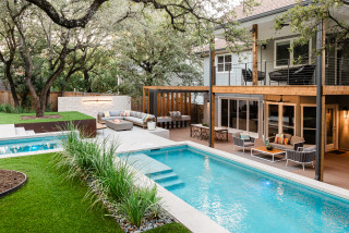
José Roberto Corea of Austin Outdoor Design transformed the yard into a series of outdoor rooms featuring a pool, a spa, an outdoor shower, a fire table lounge, a play area, a renovated two-story porch and a pergola-covered dining and grilling area. At the same time, he preserved several existing live oak trees. The result is a cohesive, beautifully terraced modern yard that the whole family and their friends enjoy.
This article was originally published by a www.houzz.com . Read the Original article here. .

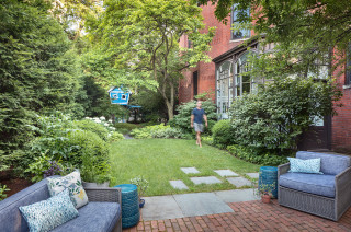
“This is a shady garden and naturalistic play space. I wanted to add shade-tolerant plants with lots of textures and different-colored leaves,” Prassas says. “These include ferns, hostas, grasses and sumacs that make it more interesting for the kids. Another plant I included is witch hazel, which flowers when nothing else is flowering.” The witch hazel species he planted is Autumn Embers vernal witch hazel (Hamamelis vernalis ‘Autumn Embers’, zones 4 to 8).
Woody plants Passas added to the garden include ‘Little Henry’ Virginia sweetspire (Itea virginica ‘Little Henry’, zones 5 to 9), cutleaf staghorn sumac (Rhus typhina ‘Laciniata’, zones 3 to 8), Snowmound spirea (Spiraea nipponica ‘Snowmound’, zones 3 to 8), bottlebrush buckeye (Aesculus parviflora, zones 4 to 8) and a variety of hydrangeas.
How to Create a Beautiful Shade Garden
This article was originally published by a www.houzz.com . Read the Original article here. .

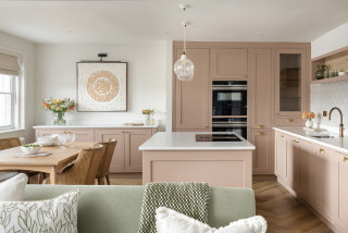
One of the homeowners had contacted the designer as she liked the look of her previous projects, which blend soft, earthy colors and classic style. She asked Colley to design a kitchen, dining area and living space in the home’s one large public room. “There was a lot to fit in, so it was about keeping it light and bright so it didn’t overpower,” Colley says.
The starting point for the kitchen was a paint sample of a pinkish-brown shade. “I just took a shine to the color,” she says. “I wasn’t sure [the owner] would like my suggestion, but she absolutely loved it.”
This article was originally published by a www.houzz.com . Read the Original article here. .

This home in Northampton, England, had a kitchen with an adjoining dining area and a living room in a conservatory, but it felt gloomy and cramped. The owner, who lives here with her two sons, found interior designer Eleni Fantis on Houzz and asked her to rethink the design. “[The owner] wanted a real family space, with defined areas, but where they could all gather, cook, entertain and enjoy being together,” Fantis says.
Before Photo
Kitchen at a Glance
Who lives here: A woman with two sons
Location: Northampton, England
Size: About 120 square feet (11 square meters); 12 by 10 feet
Designers: Eleni Fantis of Omorfia Interior Design (interior design) and Ezra Kerr of Jikoni Interiors (kitchen design)
Before: The original kitchen was put in when the house was built. While there was plenty of storage, the arrangement made the area feel cramped.
Fantis wanted to use a kitchen company that would make the most of the space. Enter kitchen designer Ezra Kerr.
The kitchen is the heart of the space and it was important that this was somewhere the owner could feel relaxed and enjoy making food, entertaining and teaching her boys to cook.
Find an interior designer on Houzz
Luckily, there’s a utility room through the door opposite the sink, so he didn’t need to find space for laundry appliances.
He made more use of the short wall with a full-height pantry cabinet — one of the owner’s key requests — a refrigerator and cabinets above and below the combination and standard ovens.
Kerr stopped short of the ceiling for a maximum sense of space. “Having units to the ceiling makes a room look smaller — when you can’t see the wall above, it closes everything in — so we left a gap,” he says.
Shop for your kitchen
The white doors are vinyl-wrapped, making them robust, and the white countertop is durable quartz. Kerr went with a curved ceramic sink to add interest.
Fantis chose pretty pink and blue tiles for the backsplash. “[The owner] didn’t really have any pattern in her home, so I wanted to incorporate some delicate patterns so as not to overwhelm her,” she says.
Kitchen cabinet paint: Satin White and Richmond Denim, Jikoni Interiors
Find a kitchen designer
“Usually, the [cooktop] would go on the back wall, but because there was no space, that was the only way we could do it. You could have had a [standard] peninsula, but we tried to make it a bit more special. It makes the kitchen feel cozy and works really well in the space.”
New to home remodeling? Learn the basics
The wood-look luxury vinyl tile flooring pairs well with the oak shelves, and looks and feels warmer than the original tiles.
“[The owner] wanted us to fit in as many seats as we could,” Kerr says. “We created the circular shape so you can have people sitting round being sociable without all sitting in a line.” This section of countertop is oak, giving it the feel of a table.
The induction cooktop has a downdraft ventilation system that vents out through the wall. “An extractor hanging from the ceiling would have blocked the room,” Kerr says.
See why you should hire a professional who uses Houzz Pro software
Kerr has tucked a wine fridge and another cabinet into the peninsula unit. Neither is obvious from the living area, but they help maximize the storage.
An upholstered bench offers an additional seating spot when guests are over.
Before Photo
Before: Originally, the dining area was in the small room to the left and the living area was in a conservatory to the right.
After: Fantis had most of the wall between the two spaces removed. She sited the seating area near the French windows and moved the dining area into the conservatory.
Light can now circulate between the spaces, making them feel brighter and bigger.
The large armchair between the living room and kitchen is key to the color scheme. “The floral fabric was actually the beginning of the whole design, and is a printed velvet,” Fantis says. “[The owner] loved it so much, I persuaded the supplier to sell me additional [fabric], which we then used for some of the blinds.”
The original dark red curtains have been swapped for these pale blue ones, which fit with the fresh, light color scheme and are less dominating.
Before Photo
The conservatory roof had been badly lined in the past, so Fantis had that replaced.
This article was originally published by a www.houzz.com . Read the Original article here. .
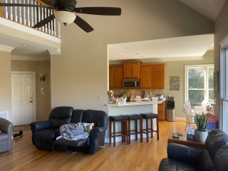
The Ryders expanded the home into what was once a deck to create a new living room. That allowed them to knock down walls and open up the kitchen footprint into the former living room to create an open-plan concept that breezily connects the new kitchen, dining and living spaces. It also freed up room for a large kitchen island that seats six. A mix of soft white and light gray cabinets and marble-look quartz countertops establishes a fresh and clean look. Wood flooring and hand-hewn wood ceiling beams add warmth. And a built-in coffee station ensures that the homeowners are well-caffeinated to manage the lively household.
This article was originally published by a www.houzz.com . Read the Original article here. .

To get reoriented, scroll down to the bottom to see the first-floor layout.
Foster laid out the all-electric kitchen, and the design team, Studio IQL, selected the finishes. The owners wanted the new materials to feel like they would age gracefully with the old ones, they told In With the Old, so they opted for soapstone countertops on half of the island and on the coffee bar, which backs up to the pony wall.
After some trial and error, the original pressed tin ceiling was painted bronze, but in this photo you can see a small section in the center that was left unpainted to show off its original patina.
This article was originally published by a www.houzz.com . Read the Original article here. .

As for the house, the couple wanted a home where their children would grow up, but they were also thinking about how it would function for them once the kids flew the nest. As someone born and raised in the area, Tice wanted the design to nod to his favorite “old-school” Bethany Beach cottages while also having a more modern and minimalist design.
This article was originally published by a www.houzz.com . Read the Original article here. .

With the end of 2024 approaching, NAHB’s Eye on Housing is reviewing the posts that attracted the most readers over the last year. In September, Catherine Koh dived into data on the homeownership rate of various household types including married couples with children, married couples with no children, single parents, and others.
The homeownership rate for multigenerational households increased by 4.9 percentage points (pp) over the last decade, but there’s another household type that experienced an even larger increase in the homeownership rate over the same period—single parent households.
In further analysis of the Census’s American Community Survey (ACS) data, NAHB dives deeper into the homeownership rate for other family household types: married couples with no children, married couples with children and single parent households. In 2022, most family households were married with no children (44%), followed by married with children (26%), single parents (12%), others (12%), and multigenerational families (6%). This composition has not changed much, with the exception of a gradual decrease in the share of married with children and single parent households, which is offset by an increase in the share of married with no children households.
The homeownership rate for single parent households saw the largest gains in homeownership rate with an increase of 5.7 percentage points over the decade. However, the overall level of homeownership rate for single parent households remains the lowest among all other family household types at just 41%. Another group that saw a large increase was the married couple with children households, with a 4.5% increase over the decade from 73% to 78%. Like multigenerational households, these increases were spurred on by historically low mortgage rates in 2021.
The only household type to have plateaued was married without children. As a matter of fact, these households saw decreasing homeownership rates for a few years before creeping back up to be at roughly the same rate as they were ten years ago at 84%. Nonetheless, married without children households remain as the group with the highest homeownership rate with an average rate of 84% over the decade.
We also examined the estimated home price-to-income ratio (HPI) for various household types. To calculate the home prices for recent homebuyers we used the median property value for owners who moved into their property within the past year. Here is where we see the effect of how multigenerational households were able to lower their HPI with pooled income and budgets. In contrast are single parent households with their estimated home prices approaching five times their income, indicating that these households are significantly burdened by housing costs.
Given that homeownership rates jumped in recent years for most household types despite increases in home prices suggests that the low mortgage rates in 2021 made steep home prices more palatable for homebuyers to enter the market. However, it is unlikely that we’ll see a continued increase in homeownership while mortgage rates remain elevated.
Discover more from Eye On Housing
Subscribe to get the latest posts sent to your email.
This article was originally published by a eyeonhousing.org . Read the Original article here. .

Kitchen at a Glance
Who lives here: A couple with a blended family that includes six young adult kids
Location: Shakopee, Minnesota
Size: 238 square feet (22 square meters)
Designers-builders: Steve McDonald and Angela Barnhart of White Birch Design
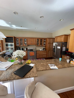
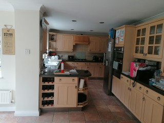
Before: The kitchen’s short cherry cabinets, beige walls and brown granite countertops made the space feel drab and dated. “They just wanted to add cabinets that go to the ceiling and add an island and paint everything, but that wasn’t solving problems for the kitchen itself,” Barnhart says.
The awkward angled peninsula with the sink cut the kitchen off from the family room. “You had to go all the way around the peninsula to get in and out of the kitchen,” Barnhart says. “When you entertain and have a bunch of people there, it becomes very difficult.”
A large stainless steel refrigerator jutted past the cabinetry, and a pair of wall ovens with a TV above them crowded the space even further. The homeowners liked the maple floor but not its dark stain, and they wanted to keep the charm of glass-front cabinets above the range wall in the updated design.