This article was originally published by a www.houzz.com . Read the Original article here. .

![]()
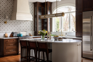
This empty-nest couple in California turned to designer Lori Ramsay to help reimagine the basic white kitchen in the wife’s Mediterranean-style childhood home, located in a San Diego master-planned community. Their goal was to honor cherished memories while improving function, storage and style in the 125-square-foot space. Ramsay kept the original footprint mostly intact but elevated the design with white-and-wood cabinetry, brass hardware, and countertops and a backsplash in striking white granite with bold veining and forest green crystals. A new peninsula adds storage, seating and a workstation sink, while the former breakfast area now houses a glamorous bar with glass-and-brass shelving.
Before Photo
Kitchen at a Glance
Who lives here: An empty-nest couple
Location: San Diego
Size: 125 square feet (11.6 square meters)
Designer: Lori Ramsay Design
Before: The nearly all-white kitchen included a short peninsula, white appliances, white solid-surface counters and basic cabinetry without hardware. A cove ceiling added to the dated look. “The cove ceiling was something I wanted to remove, but the budget wouldn’t allow it,” Ramsay says.
While the layout created an efficient work triangle between the sink, range and refrigerator, a small microwave above the range lacked proper ventilation, and the bulky refrigerator jutted into the walkway. “The kitchen functioned very well,” Ramsay says. “The primary concern was that the whole thing was dated and didn’t have style. This homeowner has great taste and the dated kitchen didn’t reflect her personality.” The wood-look laminate floor offered a visual break from all the white but was worn and ready for replacement.
A soft white wall and ceiling color with warm khaki undertones (Neutral Ground by Sherwin-Williams) creates a cozy backdrop that helps the cabinetry stand out. Polished Alpine granite, with bold ebony, graphite and gray veining and forest green crystals, forms the countertops and slab backsplash, adding color, movement and drama. “That was the kickoff for the kitchen,” Ramsay says. “She found that slab and fell in love with it, and that informed all the other decisions.”
Cabinetry hardware: Erika pull in warm brass, Atlas Homewares
Find kitchen remodelers near you
In addition to the lights inside the hood, the kitchen also includes updated LED ceiling lights and undercabinet lights over task areas.
Range: Café; range hood insert: Monsoon Mini II, Zephyr
Shop for your kitchen
Before Photo
A pantry cabinet next to the refrigerator had fixed shelves inside. “It was only 12 inches deep,” Ramsay says. “That’s why you see such a disparity between the full-depth refrigerator and the pantry.”
See why you should hire a professional who uses Houzz Pro software
Before and After: 4 Inviting Kitchens in 120 to 160 Square Feet
25 Genius Kitchen Storage Ideas
To the left of the sink is a double-drawer white-and-gold dishwasher that complements the fridge. A trash and recycling pullout sits in the peninsula, perpendicular to the sink. “We couldn’t fit the trash to the right of the sink, so that was the most logical place to put it,” Ramsay says. “Because these homeowners are empty nesters, using one small oven or one of the dishwasher drawers just makes sense.” Floating rift-cut white oak shelves at the end of the upper cabinetry provide a perfect spot for plants or decorative items.
Sink: Elkay; faucet: Artesso in luxe gold, Brizo
6 Expert Tips for Banishing Kitchen Clutter
Before Photo
Before: A small breakfast area with a table and chairs sat just off the kitchen but wasn’t used regularly. “They didn’t use it often and she wanted a bar,” Ramsay says. A pot rack hung over the sink, adding visual clutter. A structural post in the space needed to remain in place, as removing it would have been too costly.
New to home remodeling? Learn the basics
Custom brass shelving: Soil & Oak Design; glass shelving: RB Glass & Mirror
This article was originally published by a www.houzz.com . Read the Original article here. .
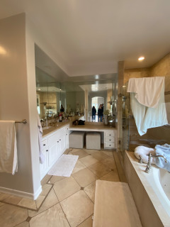
Siemer and Pestka brought in dark-stained wood vanities that improve storage and add rich warmth. A new makeup area sits in a stylish arched niche. A freestanding tub creates more breathing room. A luxurious new shower with a frameless glass enclosure improves the showering experience. And beige-and-white checkerboard flooring adds an elegant touch.
This article was originally published by a www.houzz.com . Read the Original article here. .

Wanting more openness, efficiency, color and contemporary materials, the couple hired designer Sean Lewis for help. Lewis got to work knocking down the wall to open the kitchen to the dining room. He added a peninsula with seating that improves connection between the two spaces. Closing off an exterior door to the driveway freed up room to add more cabinetry and improve storage. Gray paint for the cabinets with brass hardware and other brass details creates an elegant style. A graphic black-and-white porcelain tile floor energizes the new kitchen, while a black-painted open pantry brings a dramatic touch.
This article was originally published by a www.houzz.com . Read the Original article here. .
The landscape design includes smart features. “We used a Sonance sound system with two subwoofers and six speakers within the garden spaces, as well as speakers in the cabana that are controlled by a home automation system,” Stucchi says. “The landscape lights, the bistro lights and the lights in the cabana are all controlled by a Lutron system app on the homeowners’ phones.”
Paperbark maples (Acer griseum, USDA zones 4 to 8; find your zone), which are multistemmed trees with beautiful bark, frame the cabana. “About a million resident wild bunnies severely limited our plant palette with their insatiable appetites for herbaceous perennials. No amount of rabbit deterrent would help us there. We tried everything,” Stucchi says.
He used trees, flowering shrubs, evergreens and grasses for structure, color and texture. These include a mix of hydrangeas, ‘Karl Foerster’ feather reed grass (Calamagrostis x acutiflora ‘Karl Foerster’, zones 4 to 9) and both Blushing Knock Out roses (Rosa ‘Radyod’, zones 5 to 11) and Knock Out roses (Rosa ‘Radrazz’, zones 5 to 11).
This article was originally published by a www.houzz.com . Read the Original article here. .
![]()
The area with the X shape is a double shower area, with the shower heads marked at the top and bottom of the plan. The shower area is about 3 feet wide, but because of the wet-room layout, it feels larger. “With the tub height, it’s not like they will bump their elbows on a wall when they are washing their hair,” Gilmour says. The freestanding tub occupies the area under the window. The shower floor slopes slightly toward the drain, represented by the square in the middle of the X shape on the plan.
The toilet wasn’t photographed, but it’s at the bottom left corner, with the entry from the bedroom to its right. The double vanity runs across the top of the plan.
This article was originally published by a www.houzz.com . Read the Original article here. .

This 1907 home on a spacious lot in New Jersey had many beautiful details, including walnut millwork and original molding. But those details had aged past the point of rescue. So the homeowners reached out to designer Anastasia Harrison of AHD&Co to help update the home while honoring its roots. Harrison, who uses Houzz Pro business software, started by taking a piece of original stained walnut to a millworker and creating a match for new rich walnut cabinets in the kitchen. A new curved island has reeded detailing that complements reeded lighting and glass cabinet doors.
Elsewhere, fresh elements like a salmon pink paint for that original molding in the dining room, brick-look porcelain tile in a herringbone pattern for the mudroom and a light-filled en suite bathroom in a former sunroom ensure this home will remain timeless for years to come.
Read more and save photos
This article was originally published by a www.houzz.com . Read the Original article here. .

Maney placed a new paneled refrigerator on the wall on the right, allowing her to put the new cooktop and statement walnut vent hood on the back wall. That allowed her to create a new walnut island with an uninterrupted soapstone countertop that offers plenty of prep space and encourages gathering. The perimeter countertops are also soapstone, offering a touch of contrast and drama to the white cabinets.
Maney extended the cabinets to the ceiling with crown molding to maximize storage and give the space a loftier appearance. New engineered white oak flooring in wide planks anchors the room in warmth.
Cabinetry: Crystal Cabinets; floor: Expressions in color Sonnet, Shaw Floors; wall paint: Accessible Beige, Sherwin-Williams; trim paint: Super White, Benjamin Moore
Find kitchen remodelers near you
This article was originally published by a www.houzz.com . Read the Original article here. .

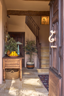
House at a Glance
Who lives here: A couple with five children between them
Location: Var region, Provence, France
Size: Five bedrooms and four bathrooms on three floors
Designers: Stephanie Bailey and Jo Miller of Decorbuddi
The owner bought this former olive farm in 2024 as a place he and his wife could share with friends and extended family. He wanted a warm and livable design, with sustainable choices throughout and a “wow” moment here and there. “He didn’t want anything so precious that if he broke it, he would be weeping,” Bailey says.
The owner loves Moroccan style, but has worked all over the world. “He’s lived in India, Sri Lanka and Nepal and is really well traveled,” Bailey says. “He has lovely textiles, amazing bold colors and a lifetime’s collection of interesting art and objects in his London house. When Jo and I were presenting mood boards to him there, we saw it and were like, OK, we get what he likes.”
Miller agrees. “To start with, the owner wanted Moroccan and he wanted color, but we swiftly realized he wanted a world look,” she says. “The challenge was to offer him that kind of aesthetic, but to incorporate it within a French farmhouse.”
The walls in the hall and landing are painted a warm pinky beige shade. “We wanted it to be really ambient and a bit moody in there, and we knew we had good lighting going in that this tone would work with,” Bailey says.
Miller sourced the old table in France. “We had to have it cut down or it wouldn’t have fitted here,” she says. “It was more like a table than a console originally.”
Hall and landing wall paint: Leather V, Paint & Paper Library; table: Pamono