![]()
This article was originally published by a www.houzz.com . Read the Original article here. .

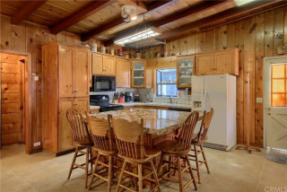
After: To preserve the kitchen’s architectural integrity and character, they kept the wood beams but painted the rest of the kitchen’s dated woodwork. “Some people might not like that we painted the ceiling,” Glaister says. “But the wood was so old, orange and heavy-looking. We needed it to look clean and light. However, the V-groove paneling was very helpful for adding texture and rustic charm, and we were glad it was there.
The ceiling, painted in Sherwin-Williams’ Natural Tan, lightens the space and highlights the texture of the wood and paneling.
This article was originally published by a www.houzz.com . Read the Original article here. .
Kitchen at a Glance
Who lives here: A couple with a blended family that includes six young adult kids
Location: Shakopee, Minnesota
Size: 238 square feet (22 square meters)
Designers-builders: Steve McDonald and Angela Barnhart of White Birch Design
Before: The kitchen’s short cherry cabinets, beige walls and brown granite countertops made the space feel drab and dated. “They just wanted to add cabinets that go to the ceiling and add an island and paint everything, but that wasn’t solving problems for the kitchen itself,” Barnhart says.
The awkward angled peninsula with the sink cut the kitchen off from the family room. “You had to go all the way around the peninsula to get in and out of the kitchen,” Barnhart says. “When you entertain and have a bunch of people there, it becomes very difficult.”
A large stainless steel refrigerator jutted past the cabinetry, and a pair of wall ovens with a TV above them crowded the space even further. The homeowners liked the maple floor but not its dark stain, and they wanted to keep the charm of glass-front cabinets above the range wall in the updated design.
This article was originally published by a www.houzz.com . Read the Original article here. .

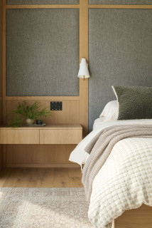
To make sure your bedside setup is as cozy as it is functional, there are a few things to keep in mind.
First of all, aim for a reading light that’s bright enough to light up your page but not so bright it gets in the way of winding down. Think about tone, brightness and direction.
“I pay close attention to the placement and direction of each fitting — for instance, specifying low-level, warm reading lights that don’t cast glare across the pillow,” says designer Philippa Rae. “The goal is to … support rest and relaxation in the evening.”
The sconce in this A. Perry Homes bedroom provides soft, diffused illumination.
This article was originally published by a www.houzz.com . Read the Original article here. .

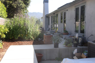
The vine growing up the corner of the house and along the entry overhang was another priority within the design. “This is a hop vine [Humulus lupulus, zones 4 to 8] that the homeowner has been growing for many years. He had trained it across the overhang, and it was important to him that we protect it,” Galante says.
Galante reports that the homeowners love their pots and planters. She filled the built-in brick planters around the patio with ‘EverColor Everest’ Japanese sedge (Carex oshimensis EverColor Everest ’Carfit01’, zones 5 to 9), which adds soft color and texture against the fence. The pot on the right has autumn fern (Dryopteris erythrosora, zones 5 to 8) and creeping jenny (Lysimachia nummularia, zones 3 to 9).
This article was originally published by a www.houzz.com . Read the Original article here. .

A soft pendant lamp over the table provides a warm glow in the evening.
The team used Houzz Pro tools to share the design with their clients, as well as the products they specified.
“We use Houzz to manage all our projects and, in particular, the Selections boards, where clients can see all the items we’ve proposed,” Matthews says.
The Selections boards allow professionals to present items they’re considering for the project in a simple format that helps clients feel in control. They can see an image of each product and all of the information at a glance, then quickly press Approve or Decline.
Wall paint: Slate ll and Lead IV, both Paint & Paper Library
See why you should hire a professional who uses Houzz Pro software
This article was originally published by a www.houzz.com . Read the Original article here. .

The new design has patios, seating areas, container gardens and more. “My clients love to entertain large groups, but [they] also wanted cozy spots for smaller groups to gather,” Howard says. She created outdoor rooms so guests could spread out during parties. New garden areas allow the homeowners to grow fresh flowers for parties, and herbs for garnishing homemade pizzas.
This article was originally published by a www.houzz.com . Read the Original article here. .

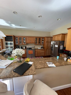
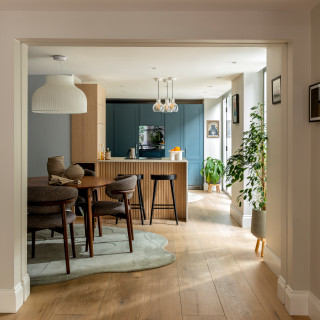
Parents of three now-grown sons, the couple were finally ready to make serious changes. They hired designer Jodi Swartz to help improve both function and style. While the overall layout stayed mostly the same, two-tone custom cabinets in a classic white for the perimeter and a robin’s-egg blue for the expansive island give the kitchen a fresh look. A dual-fuel range in a soft shade of blue and blue backsplash tiles complement the island. Touches of black add dramatic contrast. Elegant marble countertops, warm oak flooring and a cozy seating area near a fireplace elevate the kitchen with timeless appeal.
This article was originally published by a www.houzz.com . Read the Original article here. .

House at a Glance
Who lives here: A retired couple
Location: Bronxville, New York
Size: 2,500 square feet (232 square meters); two bedrooms, 2½ bathrooms
Designer: Curated Nest
Contractor: DTF Rosemount
The homeowners were happy with the condo’s open floor plan after having lived with smaller, more compartmentalized rooms in their previous Tudor-style home.
Galvao and Coren identified the couple’s style by visiting their house during a thorough design phase. This included sharing inspiration images, discussing their vision, understanding how they live and reviewing their art collection.
“They have the kind of art collection where they had picked up pieces on their travels and every piece had a story behind it,” Galvao says. “We were able to discern a lot about their style from their art collection.”
The well-traveled couple spend extended periods abroad for the husband’s job. He’s English and their time living in England gave the wife, a jazz composer with an Italian background, a deep appreciation for afternoon tea. The entry, seen here from the living room, includes a tea nook, coat closet and powder room.
Find an interior designer on Houzz