
Warm contemporary style strikes a nice balance in a kitchen. It offers the clean lines and easy function of modern design but with natural materials and soft tones that make a kitchen feel welcoming. In the following seven spaces, designers used wood, texture, streamlined storage and abundant light to create kitchens that feel calm, connected and comfortable.
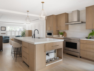
Designers: Mary Englert and Kate Adams of Case Architects & Remodelers
Location: Potomac, Maryland
Size: 430 square feet (40 square meters)
Homeowners’ request. “The owners had previously renovated the kitchen but, after a decade of use, were unhappy with how the space functioned for them,” says designer Kate Adams. “Their goal was to remove a wall between the kitchen and formal dining room to create a more open space. Their biggest requirement was more light, more storage, wider aisles and an earthy, clean, contemporary look. We actually flipped the kitchen and dining room in order to gain more light in both spaces. This also allowed us to create a large walk-in pantry, something they were lacking before.” The homeowners found the remodeling firm on Houzz.
Contemporary elements. Alder cabinets in light and dark stains. Painted white MDF cabinets. “The clients desired an ‘earthy-zen’ space with a focus on natural materials and colors,” Adams says. “One major goal was to bring more light into the space and open up views to the wooded backyard. We decided that a more modern look with clean lines would better allow for this. The simple details on the cabinets allow the various wood tones and Taj Mahal quartzite countertops to speak for themselves, and carry more visual weight. Slab doors were debated but we chose a thin-stile Shaker cabinet door to add more depth and dimension to the large kitchen. We find this door style to be a perfect option for clients looking for a more modern look but still wanting to remain slightly transitional without making the jump to a more contemporary slab door style.
“We used three different cabinet colors, in a color block arrangement to keep your eyes moving and create interest. The two wood tones help to warm up the large space. Paneled built-in appliances add to the modern look, limiting the visual clutter that large appliances can sometimes add. The dark green tiled backsplash adds depth and dimension with its fluted pattern and pulls the greens of the backyard in through the new windows.”
Other special features. “At the main sink, we replaced the existing windows with a large bay window, raising the head height to meet the ceiling, which maximizes natural light and the visual connection to the outdoors,” designer Mary Englert says. “We wrapped the windowsill with countertop material for a durable and seamless plant ledge. A dedicated coffee bar near the dining area is both practical and functional. It features its own sink with a reverse-osmosis filtration system and faucet, as well as a fully integrated undercounter beverage fridge. Reeded glass pocket doors and glass-front cabinetry echo the fluted backsplash tile, creating a subtle design detail.”
Designer tip. “Make sure everything has a home — thoughtful storage solutions are a must,” Englert says. “With minimal wall cabinets, we added peg organizers in deep drawers for dishes. A pullout next to the range provides storage for cooking utensils and knives to keep the countertops free from clutter. For added convenience, a docking outlet was added inside a drawer to create a hidden charging station. Even the family dog was considered. An open base cabinet allows for food and water bowls to be kept accessible yet discreetly out of the way.”
Flooring: Red oak
Find a home professional on Houzz
Designers: Cameron Cruse, Rick Berry, Brian Campbell and Ryan Yoshida of Scott Edwards Architecture
Location: White Salmon, Washington
Size: 256 square feet (24 square meters)
Homeowners’ request. “When envisioning daily life in their new home, the clients spoke of sharing a cup of coffee at the island while looking at the tranquil view,”
says designer Cameron Cruse. “The layout of the kitchen provides an intimate and well-organized experience particular to the clients’ lifestyle. Each cabinet is meticulously designed and placed in alignment with how the clients use the space, with the spice drawer next to the cooktop and dish storage directly behind the dishwasher in the island. Display areas for treasures, art and cookbooks are woven throughout.”
Contemporary elements. “The home’s restrained design and the timeless materiality of the contemporary style deliberately integrate with the surrounding natural environment, and the interiors are quiet and refined — a comfortable and well-considered setting for daily life,” Cruse says. “The kitchen is light and airy, and the design is characterized by organic textures and materials balanced with modern lines.”
Other special features. “Caesarstone quartz in the color Cloudburst Concrete gives a seamless, light clay-like backsplash,” Cruse says. “Using walnut on the island and open shelves provides warmth.” The hood is lime plaster.
Designer tip. “Detailing cabinet drawers and doors with integrated eased-edge finger pulls contributes to the clean lines and serenity of the space,” Cruse says. “Reducing the pulls, knobs and hardware throughout simplifies the palette and calms your eyes.”
“Uh-oh” moment. “The client requested no sink or stove on the kitchen island, which can be a difficult ask because it challenges the design tool of creating the refrigerator-sink-stove triangle,” Cruse says. “After conducting several space studies, we found a solution that worked for the client.” They located the paneled fridge, sink and induction cooktop around one side of the island.
“In the end, it’s a lovely experience to sit at the furniture-styled island with no threat of water or heat nearby.”
Know the 3 Zones of Kitchen Storage
Architect: Norman Sanchez Architecture
Location: Oakland, California
Size: 300 square feet (28 square meters)
Homeowners’ request. “The goal was to modernize the kitchen and the appliances in a way that felt at home with the original midcentury architecture,” says architect Norman Sanchez. “Our client wanted ample storage in order to keep the countertops clean and free of appliances. In addition, we sought to make visual and physical connections to the adjacent spaces more direct in order to improve flow and sightlines.”
Contemporary elements. “The contemporary style was chosen for its clean lines and simple elegance, which both work well to complement the midcentury aesthetic,” Sanchez says. “Flush dark gray panels for the millwork, minimalist pulls and appliances with cabinet panels are all elements of the contemporary kitchen. The walnut island and side panels add warmth to the otherwise cool palette and help to make the sleek lines of the kitchen feel at home in this midcentury gem.”
Other special features. Quartersawn white oak flooring. Black faucet, hardware and range hood vent.
Designer tip. “The use of a lighting control system allowed us to reduce the amount of visible switches throughout the kitchen,” Sanchez says. “It also allowed us to control the various types of lighting via preprogrammed scenes, making it easier to set the mood for a gathering or turning on all the lights needed for preparing dinner with the touch of a single button.”
The 10 Most Popular New Kitchens Right Now
Designer: Maggie Lunetta
Contractor: PorchLight Homes
Architect: Lake Country Builders
Location: Minnetonka, Minnesota
Size: 345 square feet (32 square meters); 15 by 23 feet
Homeowners’ request. “The homeowners loved their home, but it wasn’t working for their growing family,” says designer Maggie Lunetta. “The kitchen had limited storage, an undersized island and appliances that were dated and starting to fail. They also had two dining areas, but the formal dining room was rarely used. We decided to tap into that underutilized space to expand the kitchen footprint, making room for a large island with seating, a walk-in pantry and more efficient — and hidden — storage throughout. The goal was to create a kitchen that felt open, functional and family-friendly while still maintaining a clean, elevated aesthetic.”
Contemporary elements. “A contemporary direction felt right for this family — clean lines, subtle contrast and a calm, livable sophistication,” Lunetta says. “Flat-panel cabinetry in a mix of white oak and painted finishes adds warmth and balance, while Taj Mahal quartzite countertops that continue up the backsplash create a seamless, elevated look. Integrated, panel-ready appliances keep everything streamlined. The large island anchors the space with generous storage and seating, and the walk-in pantry — wrapped in patterned wallpaper on the walls and ceiling — adds just the right touch of drama and personality.”
Other special features. Rift-sawn white oak flooring. Dark green island (Greenblack by Sherwin-Williams). “Storage was carefully planned, with custom drawer organization throughout, including spice drawers, pullout racks for knives and utensils and dedicated compartments for cutting boards and dishware,” Lunetta says.
Designer tip. “I always start by asking how my clients want the space to feel and function — before we ever talk about finishes or layout,” Lunetta says.
“Uh-oh” moment. “During installation, we discovered that the pendants we selected were heavier than anticipated and required additional stabilization,” Lunetta says. “Of course, the ceiling and drywall were already complete when this came up, so it took a bit of coordination to make it work. With some creative problem-solving and teamwork, we were able to fit the fix into the schedule, and the pendants became one of the standout features of the space. It was a good reminder that sometimes it’s worth proactively adding extra support for lighting early on, especially when you’re working with larger or more substantial fixtures.”
Island lights: Elliot Grande pendant, Visual Comfort; project photos: Alyssa Lee Photography; wall paint: Drift of Mist, Sherwin-Williams
How to Design a Kitchen That Brings People Together
Designer: Leslie Teague of Kenorah Design + Build
Location: Port Moody, British Columbia
Size: 160 square feet (15 square meters); 10 by 16 feet
Homeowners’ request. “They wanted a modern design with warmth and texture,” says designer Leslie Teague. “The floor plan remained fairly similar to the original, but they had an old, dated, angled walk-in pantry that was taking up too much space and would not allow for a bigger island. So we modernized the space with a cabinet pantry and we were able to increase the island size.”
Contemporary elements. “In order to give a contemporary feel, we went with slab cabinets and a quartz counter and backsplash, but warmth and texture in the design were also important,” Teague says. “So we went with a warm wood tone on the cabinets and added texture on the back of the island with a fluted back panel and a plaster finish on the hood.”
Designer tip. “Balance is important,” Teague says. “The black handles and black stainless steel appliances are spread throughout as an accent and don’t overpower anything.”
“Uh-oh” moment. “The clients had originally wanted wood cabinet doors, but that was pushing the budget so we were able to find a beautiful wood laminate look for the doors and still achieve the quality and look they wanted,” Teague says.
New to home remodeling? Learn the basics
Designer: Jacob Kindler of Urban Homes
Location: Englewood, New Jersey
Size: 352 square feet (33 square meters); 16 by 22 feet
Homeowners’ request. “The homeowners requested a warm yet contemporary kitchen with dramatic natural stone, abundant light and seamless indoor-outdoor flow,” says designer Jacob Kindler. “They wanted functional elegance — ample storage, professional appliances and sculptural lighting blending sophistication with comfort.”
Contemporary elements. Flat-panel cabinets. Stained wood island and other details. Dramatic marble countertops and backsplash.
Other special features. Dual sinks with black fixtures. Integrated open shelving. Built-in bookcase in the island.
Designer tip. “Balance bold materials with simplicity,” Kindler says. “When using a dramatic stone like this marble, keep cabinetry and fixtures understated — matte finishes, clean lines and neutral tones allow the natural stone to shine while maintaining harmony and sophistication.”
“Uh-oh” moment. “I remember standing with the homeowners as the marble island was being uncrated,” Kindler says. “We all held our breath — the veining was far bolder than it looked on paper. For a moment, we wondered if it might overwhelm the space. But once the slab was set in place, the entire kitchen came alive. The natural movement of the stone anchored everything — cabinetry, light, even the view beyond the windows. That was the moment we all knew: This kitchen had found its soul.”
More on Houzz
Read more stories
Browse photos for ideas
Find home professionals
This article was originally published by a www.houzz.com . Read the Original article here. .


Designers: Lauren Magee, Maria Williams and Michael Winn of Winn Design + Build
Location: Alexandria, Virginia
Size: 252 square feet (23 square meters); 14 by 18 feet
Homeowners’ request. “The homeowners envisioned a clean, modern kitchen with better functionality and stronger visual connection to the rest of the home and the outdoors,” says designer Michael Winn. “The original kitchen was small, dark and closed off from both the dining area and backyard. They wanted a space that would feel open, bright and streamlined yet warm and would support everything from casual breakfasts to entertaining guests. Expanding the footprint and rethinking flow were key to solving their challenges.”
Winn’s firm uses
Houzz Pro software for things like lead generation, Mood Boards and client communication.
Contemporary elements. “Contemporary style was a natural fit for the homeowners, who gravitate toward minimalism, natural light and a sense of calm,” Winn says. “To achieve this, we used flat-panel cabinetry in maple veneer, integrated appliances, sleek, black fixtures and clean-lined lighting. The waterfall-edge island in a muted quartz, along with white oak floors and a slab-style backsplash, contributes to the clean yet inviting palette. A folding glass wall (not shown) at the rear of the new addition off the kitchen blurs the boundary between inside and out — a modern hallmark that reinforces openness and connections.”
Other special features. Mixed metals. Integrated dog food station with dedicated pot filler. Warm ambient lighting with undercabinet LED strip lighting and integrated cabinet lights.
Designer tip. “If you’re going for a minimalist aesthetic, continuity is key — especially across surfaces and materials,” Winn says. “Matching the countertop and backsplash helps streamline the look while also reducing visual clutter.”
Wall and ceiling paint: Chantilly Lace, Benjamin Moore
See why you should hire a professional who uses Houzz Pro software