
If you’ve been tracking home color trends, you’ve likely noticed a clear shift toward warmth — both inside and out. Blues and greens are still going strong, but the cool, icy tones of recent years have melted away. In their place are earthier blue and green shades touched with yellow or brown. Grays, once the go-to neutral, are giving way to taupes, khakis and even beiges.
That move toward warmth is echoed in the latest paint trend reports from major U.S. brands, including their 2026 Color of the Year picks. While the choices aren’t identical, a pattern emerges: cozy greens, creamy neutrals and a few moody darks for contrast. Let’s take a closer look.
Warm Eucalyptus is a softly muted gray-green — think sun-dried leaves with an earthy undertone. Quieter than bolder statement greens, it feels soothing and grounded, with just enough presence to act as a modern neutral.
It’s a beautiful choice for kitchen cabinetry, pairing effortlessly with soapstone or marble counters and aged brass or matte black hardware. Try it on bookcases, bath vanities or a media console for calm, tailored color that adds depth without dominating.
See why you should hire a professional who uses Houzz Pro software
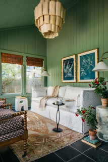
Midnight Garden is a slightly cooler, botanical green that feels fresher and brighter than the deeper, earthier olives. It brings an outdoorsy, organic vibe indoors and looks especially crisp and welcoming when paired with white.
This appetizing hue is right at home in kitchens, where it fits beautifully with warm wood tones. It also works well in living rooms or offices, creating a softly energizing mood. Balance it with textured neutrals and pale woods, or introduce contrast with inky navy, charcoal or terra-cotta accents.
Pros Share 10 Beautiful Green Paint Colors
This vivid, electric green leans sunny and yellow, bringing a fresh, tropical energy to any space. It’s high-impact and instantly energizing.
A little goes a long way: Use it on a powder room wall, the inside of a bookcase, stair risers or interior doors. If you want to go all in, make sure the room has plenty of natural light or balance it with light neutrals to soften the effect.
8 Color Trends From the Maison & Objet Design Show
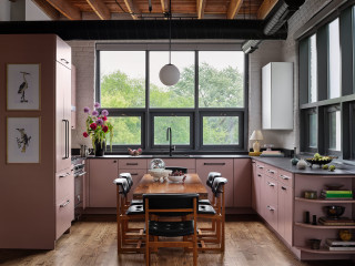
This soft tan from Sherwin-Williams was selected for its timeless simplicity. Light to medium in depth, it carries gentle yellow and brown undertones that create casual warmth.
South- or west-facing rooms will bring out its sunnier side, while north-facing spaces make it feel more subdued and cooler. As a wall color, it pairs wonderfully with crisp white trim and warm wood accents. Plus, it makes a neutral backdrop for bolder shades like rust, terra cotta, graphite or deep green.
Melodious Ivory is a pale, creamy neutral with a soft peach undertone. Lighter and brighter than the previous tan, it shares the same timeless, easygoing appeal. It plays nicely with soft greens, oranges and browns, or it can serve as a calm backdrop for bolder pops of burgundy or watery blue.
How to Confidently Choose Colors for Your Home
Named for the town in France’s Champagne region, Epernay is a crisp, luminous warm white — the cleanest and brightest of these Color of the Year picks.
Its subtle warmth keeps it from feeling stark, making it a refined alternative to gallery white. It beautifully showcases art, luxurious textures and rich wood tones. As shown here, Epernay works especially well on kitchen cabinets when you want a light, soft white rather than a pure, icy shade.
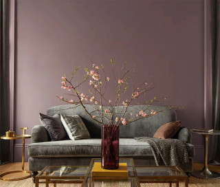
One of the few dark shades on the list, Silhouette is a deep, smoky espresso brown with a hint of gray. That subtle gray undertone gives it an earthy yet refined quality, making it versatile for a range of interiors. Whether your style leans modern and minimalist or layered and transitional, Silhouette adds elegant calm — a sophisticated neutral with depth. Pair it with light warm grays or creamy whites for contrast, or embrace its moody side with navy, rich burgundy or black.
New to home remodeling? Learn the basics
Warm Mahogany is a sumptuous red-orange softened by earthy brown undertones, perfect for wrapping a room in cozy color. It’s ideal for intimate spaces like bedrooms, as well as more public areas such as dining rooms or kitchens.
Pair it with creamy whites, bone or putty for a softer look, or add contrast with warm blackened bronze or deep olive. Natural materials and textures — walnut or oak, leather, boucle, velvet and linen — amplify its richness.
Your turn: Which of these 2026 Color of the Year picks is your favorite? Which would you pick? Share your thoughts in the Comments.
More on Houzz
Read more stories
Browse photos for ideas
Find a home professional
This article was originally published by a www.houzz.com . Read the Original article here. .


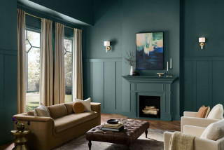
This richly saturated blue-green has a touch of smoke that tempers its boldness. Warm undertones keep it grounded and livable, giving it an elegant, slightly moody edge — a color that makes a statement without shouting.
Wrap bedroom, dining room or library walls in this hue for a cocooning feel, and balance the depth with light, textured neutrals.
Hidden Gem also shines on architectural details — interior doors, window trim, wainscoting, built-ins or a fireplace surround — for a refined, tailored look. On a kitchen island or mudroom lockers, it can anchor the space without overwhelming it.
Outside, try it on a front door for a jewel box welcome or as siding with light trim for a modern coastal vibe. It’s equally striking on shutters set against pale brick or natural stone.
Find an interior designer on Houzz