Tag

Colorful

Browsing


This couple purchased a pied-à-terre in Chicago’s Holden Block building, an Italianate-style landmark dating back to the rebuilding period following the Great Chicago Fire in 1871. Designed by architect Stephen Vaughn Shipman and built in 1872, the building is a standout, as many other Chicago commercial loft buildings were demolished to make way for skyscrapers. Its ornately carved Buena Vista sandstone facade earned it landmark status. The building’s conversion to residential condos in the 1990s was thoughtful, but the original kitchen in this unit did not celebrate the building’s history or architecture.

The owners brought in trusted designer Laura O’Brien of O’Brien Harris, who had designed two other kitchens for them in the past. The first kitchen she designed for them was classic white, while the second featured dramatic black. “This time they were ready for something entirely different — a moody, colorful space that embraces color in a way that feels timeless and unexpected,” O’Brien says. The new kitchen nods to the building’s industrial history and its elegant facade.


This article was originally published by a www.houzz.com . Read the Original article here. .


These Bellevue, Washington, homeowners wanted a kitchen as fun and relaxed as they are — full of color, pattern and personality. For 18 years, they lived with a small, dark, U-shaped kitchen with aging honey oak cabinets and no island, hardly a source of joy in their 1979 transitional-style home. The eating area had great light but was cut off by a peninsula. With one son in college and another in high school, the couple were ready for something brighter, more open and designed for gathering, complete with a spacious island, ample storage and a few surprises.

To help bring their vision to life — and to rethink the unused formal dining room off the kitchen — they turned to designer Erin Etchemendy of 31E Designs and to Houzz photos for inspiration. Removing the peninsula and dining room wall expanded the footprint by 121 square feet, making room for a long, custom island detailed with colorful patterned porcelain tiles. A walnut-and-quartzite top adds a unique twist to the light blue island base, while engineered wood flooring and flat-panel white oak cabinetry warm the space. Horizontally stacked rectangular tiles lend texture and movement, completing the bright kitchen brimming with character.

Before Photo

31E DesignsSave Photo

“After” photos by Candi Kintzley

Kitchen at a Glance
Who lives here: A couple with a son in college and another in high school
Location: Bellevue, Washington
Size: 231 square feet (21 square meters)
Designer: Erin Etchemendy of 31E Designs

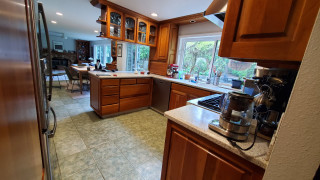
Before: This photo, taken from the doorway of the unused dining room, shows the dated 110-square-foot kitchen with its honey oak cabinets, no hardware, granite counters and cold tile floor. “They definitely wanted to get rid of that,” Etchemendy says. “They wanted to warm up the space for sure.”

Upper cabinets over the peninsula cut the kitchen off from the eating area and family room, making the already tight space feel even smaller and darker. The range wall separated the kitchen from the dining room, while the stainless steel refrigerator across from the sink jutted out awkwardly. “It felt cramped, and the organization — or lack thereof — was a problem,” Etchemendy says.

One bright spot: a large fixed window over the sink. The homeowners loved the natural light and wanted to make it a bigger feature in the new design.

After: Etchemendy removed the peninsula, cabinetry, counters and flooring, then took down the former range wall to absorb the unused dining room, expanding the kitchen from 110 to 231 square feet. “They didn’t really use the formal dining room and have that other eating area,” Etchemendy says. “We eliminated a room they didn’t use while maintaining space to eat, both in the eating area and at the new island.”

The spacious island measures 3 feet, 2 inches wide by 14 feet, 6 inches long and features light blue flat-panel cabinets and drawers — including a charging drawer — plus open shelves for cookbooks. The top combines sealed walnut and Blue Lava quartzite, the latter a stunning stone with a cool blue background and dark blue and orange veining. “They wanted to incorporate the wood, but I didn’t think it would be a good idea to make the entire island top walnut,” Etchemendy says. “This way they have somewhere to put hot pots or other items and not worry about it. It’s also just a cool feature. They just wanted to do something that was different and unique.”

The light blue of the island contrasts with the perimeter flat-panel white oak cabinetry in a honey pecan finish. Engineered oak flooring with 7½-inch brushed and smoked planks adds more warmth. “They didn’t want to go sterile and do white or be overwhelming with a bunch of color,” Etchemendy says. “Adding the wood gives a warm backdrop to the pops of color.”

The newly open kitchen flows into an updated dining area with a new built-in bar, as well as a refreshed family room with a new fireplace surround and built-ins. LED recessed ceiling lights provide flexible illumination. The homeowners skipped island pendant lights to keep the focus on the backsplash. “They were worried the pendants would get in the way of that,” Etchemendy says. “But it’s wired in case they want to add pendants in the future.”

Find kitchen remodelers near you

Encaustic-look porcelain tiles in a mix of lively patterns wrap one section of the island base, adding a playful hit of color and texture. “That was actually a request from the client,” Etchemendy says. “They both love color. When they saw this tile, they sort of fell in love.”

Tiles: Tangier Decos, Surface Art

Before and After: 4 Revamped Kitchens in 150 to 250 Square Feet

By extending the kitchen into the former dining room, Etchemendy was able to move the range to the sink wall and create an adjoining pantry and refrigerator wall with an integrated beverage station and a paneled French door refrigerator that blends seamlessly with the cabinetry. “Function-wise, this allows them to keep a lot of the food they use on a regular basis at hand,” she says. “They also have an additional pantry off their entry hallway that used to be their laundry room.” Polished marble-look quartz countertops on the perimeter add a light, durable and elegant touch.

Paint colors: Egret White (walls and ceiling) and Pure White (trim), Sherwin-Williams

See why you should hire a professional who uses Houzz Pro software

A new 30-inch, dual-fuel range features four burners and a custom drywall hood accented with a white oak band. “We had extra wood paneling for the cabinets and used that for the hood trim,” Etchemendy says.

The upgraded double-basin stainless steel sink is paired with a touchless pull-down faucet, flanked by a dishwasher to the right and a trash-and-recycling pullout to the left. The backsplash, made of 2-by-10-inch gray-tone horizontal field tiles with a glossy finish, adds subtle texture and visual height. “They really liked the idea of having a bit of physical texture to the tile but not have it be overwhelming,” Etchemendy says. “We found a suite of tile with a flat glossy finish and a stacked stair pattern that just adds more character to a long, continuous wall.”

An interior corner to the right of the sink has floating wood shelves for decorative items, with a toaster oven tucked away off the main counter. “It was going to be interesting trying to figure out how to put a cabinet there with the window so close by,” Etchemendy says. “This creates a unique feature with the open shelving.”

Backsplash tile: Lighthouse in Mist, United Tile

9 Ways to Save on Your Kitchen Remodel

Here’s a look at the beverage station tucked into the pantry wall. An upper shelf holds a microwave, while a pullout below houses the coffee maker and supplies. “It was just to get all of that behind closed doors, to avoid having busy counters,” Etchemendy says. “There are pullout drawers below for their tea and coffee, so it creates a one-stop spot for those items.”

Flat black hardware in various shapes and sizes adds flair to the pantry, refrigerator wall and the rest of the cabinetry. “These clients are all about the unique and different,” Etchemendy says. “A pantry wall can be very overwhelming, but bringing in different accents helped break it up.”

25 Genius Kitchen Storage Ideas

Before Photo

31E DesignsSave Photo

Before: This opening once separated the living room (front) from the formal dining room (back). “They wanted to open up the two spaces,” Etchemendy says. “They didn’t really use that living room.”

New to home remodeling? Learn the basics

After: Widening the opening creates a smoother flow between the updated living room and revamped kitchen, making the kitchen feel more open and connected. “This improved floor plan puts the big, bright kitchen at the center of everything,” Etchemendy says. “We were able to create a space that feels nice and open but not too grandiose.”

More on Houzz
Read more kitchen stories
Browse kitchen photos
Hire a kitchen remodeler


This article was originally published by a
www.houzz.com . Read the Original article here. .


Chelsea Ayres InteriorsSave Photo
4. Blue Chairs, Cognac Sofa

Designer: Chelsea Ayres Interiors
Location: Athens, New York
Size: 464 square feet (43 square meters); 16 by 29 feet

Homeowners’ request. “This home is perched right on the lake, and my clients wanted this lower-level living area to feel like a true extension of the water, a place where family and friends could gather year-round to relax, play games and soak up that serene lakeside vibe,” designer Chelsea Ayres says. “Our goal was to layer warmth and personality while staying true to the home’s natural setting. By introducing texture, color and thoughtful seating arrangements, we were able to transform it into a welcoming hub that feels distinctly ‘them.’”

Special features. “With such a long and narrow space, the layout called for a few separate seating areas, which we unified by wrapping the walls as well as the ceiling in Benjamin Moore Collingwood (a warm gray), creating a cohesive cozy space that disguises the low basement ceilings,” Ayres says. “Keeping things warm and cozy was also attained by careful selection of materials for furnishings. Leaning into sumptuous velvet in a rich, deep lagoon color for the accent chairs, along with a substantial wood coffee table to ground the space and ottomans made from wool to mimic lakeside stones, we struck a balance of both nature-inspired pieces that were also inviting and warm.”

A rich cognac leather sofa brings warmth to the space, while a wet bar and additional seating area anchor the opposite side of the room.

Designer tip. “Don’t be afraid to segment your seating areas in large or oddly shaped spaces,” Ayres says. “Allowing for smaller seating arrangements offers a more intimate vibe in what can otherwise feel like an overwhelming space. If you are trying to create a room where people will truly connect, you need to keep the seating arrangements smaller and clustered around tables, especially around round tables if you can. It allows for much better conversation and inclusion.”

New to home remodeling? Learn the basics


This article was originally published by a
www.houzz.com . Read the Original article here. .


After: Arnold had the house re-sided with a highly durable textured aluminum product that, painted an almost black charcoal gray, resembles shou-sugi-ban (Japanese-style charred wood siding). She paired it with a new black standing-seam metal roof.

Arnold also had the overgrown vegetation along the front of the home removed and added a poured-in-place concrete paver pathway.

The exterior architecture of the home remained largely the same, including the windows, some of which have an unusual pivot-slide function.

“They’re really beautiful,” Arnold says. “You’re not really going to get any made like that again.”

Exterior paint: Iron Ore, Sherwin-Williams


This article was originally published by a www.houzz.com . Read the Original article here. .


By the time the owners of this Victorian house in London called in interior designer Josie Lywood, they’d been living in the home for about eight years. “It was a perfectly livable space, but quite dated,” Lywood says. “They hadn’t done anything to it, as they knew they wanted to do a full refurb at some point.”

The house had already been extended at the back to create a kitchen, but this was quite narrow. A wall between two public rooms had been knocked down, creating a dark and underused living space in the center of the house. The owners wanted these structural issues resolved and an old cellar dug out to create a usable basement. They also needed more storage, particularly for coats and shoes — they have three children — and a downstairs bathroom.

“The brief was for a modern, cozy and homey scheme, harmonious with the original Victorian architecture,” Lywood says. “They were not afraid of color or pattern so we had a lot of fun creating this design.” Read on to see the beautiful results of this year-long project.


This article was originally published by a www.houzz.com . Read the Original article here. .

Pin It