Tag

Charm

Browsing


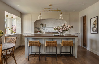
After purchasing a classic 1940s bungalow stripped of its original charm, these Seattle parents of two young boys turned to interior designer Jessica Nelson to restore it. Their goal was to reintroduce character through architectural details while keeping the home modest and family-friendly. The warm, cozy interiors were inspired by the front porch entrance’s custom white-painted wood lattice trellis structure, joined at the top in an arch and with jasmine vines beginning to grow.

One of the primary objectives was establishing a kitchen that could transition effortlessly from busy school mornings to intimate dinner parties. At just 90 square feet, the original galley kitchen was cramped and inefficient. Nelson reimagined the floor plan, converting that space into a butler’s pantry and moving the kitchen to the back of the house to capture views of evergreen trees, Lake Washington and Husky Stadium.


This article was originally published by a www.houzz.com . Read the Original article here. .
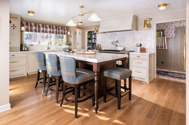


When interior designer Carrie Lucke and her husband, Dave, moved into this 1950s Cape Cod-style home in Whitefish Bay, Wisconsin, they already knew its history. Dave’s parents had owned the home for two decades, and when it returned to the market years later, the couple jumped at the chance to bring it into the modern era. “It had never been meaningfully updated,” the designer says.

Working with a remodeling team, the couple — who live with their two daughters and two dogs — stripped the first floor to the studs. By relocating the laundry room upstairs, they freed up space to create a breezier floor plan with improved connection to a family room. Custom greige cabinetry, a furniture-style island and a showstopping black French range, all anchored by elegant Danby marble countertops and a tactile V-groove paneled ceiling, give the updated space the “homey cottage” feel the couple were looking for. A walk-in pantry and mudroom, both in an equally quaint and charming style, further improve function.


This article was originally published by a www.houzz.com . Read the Original article here. .


“After” photos by Avery Nicole Photography

Kitchen at a Glance
Who lives here: An empty-nest couple
Location: Martindale, Texas
Size: 250 square feet (23 square meters)
Designer: Amanda Buckley of Bauley Interiors
Cabinetmaker: Kleighton Westphall of Monarch Woodworks of Austin
Builder: Blanco River Construction

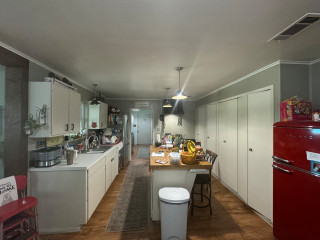
Before: Gray walls, short white cabinets and laminate counters gave the former kitchen a flat, utilitarian feel. Shallow upper cabinets flanking the sink window on the left offered little storage and blocked natural light. Ceilings in the small house were less than 8 feet high, Buckley says. “The window wasn’t that big and there wasn’t enough lighting overall. They also had a vinyl-style tile above the sink but that was their only backsplash.”

A long, narrow island with stools felt especially tight, squeezed by reach-in closets along the right wall. “That essentially was their pantry,” Buckley says. “Their small appliances and pots and pans were stacked up on each other in there.” A retro-style red refrigerator sat out in the open with no clear role, while the primary stainless steel refrigerator was tucked into the far back left corner. “The red refrigerator was sort of just there,” Buckley says. “They liked the look of it but didn’t use it much.”


This article was originally published by a www.houzz.com . Read the Original article here. .


This primary bathroom was part of the remodel of a family home in Chadds Ford, Pennsylvania, that also included the kitchen and mudroom. A referral from another client led the homeowners to Black Forest Design and Build, which handled the redesign and construction work. The primary suite changes benefited from the designers’ focus on style and functionality, with warm wood tones, black matte fixtures and contrasting white features creating a modern farmhouse feel. “The homeowners wanted a larger shower with two shower heads, a freestanding bath, double vanity and an enclosed toilet area,” says designer Beth Schulz.

Black Forest Design and BuildSave Photo
Photos by Rebecca McAlpin

Bathroom at a Glance
Who lives here: A couple and their two dogs
Location: Chadds Ford, Pennsylvania
Size: 230 square feet (21 square meters)
Design-build firm: Black Forest Design and Build

A natural color palette with soft earth tones now defines the bath, with a new walk-in wet-room-style shower as the focus feature. “The homeowners wanted the bathroom to feel like an extension of the rest of their home. While function was paramount, we also customized the space for them,” Schulz says.

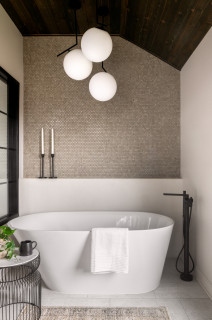
The new freestanding tub and matte black fixtures sit under a three-globe light, next to an accent wall of earth-colored penny tiles.

Tub and fixtures: Kohler; penny tile: Bedrosians

Find a design-build firm on Houzz

Before: The old bathroom had a narrow shower stall crammed between the built-in tub and the vanity. The layout didn’t quite work and the owners wanted a bigger space, specifically a larger shower. A multipaned window provided plenty of natural light and the team decided to keep it.

Black Forest Design and BuildSave Photo
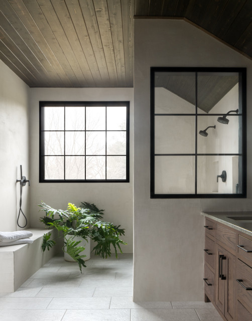
After: Black Forest Design and Build, a Houzz Pro subscriber, reconfigured the space to make room for the extra-large shower area the homeowners requested. It kept the window, which had been recently replaced, and added a wall with a window to separate the shower area from the new custom vanity.

For a rustic touch, the team used dark-stained cedar planks for the ceiling, which added texture and contrast. “We leaned into some modern farmhouse elements but gave it our own twist by layering natural elements and textures to keep the space feeling warm and inviting,” Schulz says.

See why you should hire a professional who uses Houzz Pro software

Before: Here’s the layout of the primary suite prior to the remodel, which included a linen closet and a large closet that separated the bedroom from the bathroom. Both closets were taken out to make room for the enlarged bathroom. The areas in pink indicate what was demolished.

Before: This is the view from the former primary bath into the bedroom. There are closets in the hall, which were demolished to make room for the bigger bathroom.

After: Black Forest gained space in the new bathroom (right side of diagram) by eliminating the closets. The previous shower stall was demolished to make way for a larger wet-room-style shower. The toilet area was enclosed and a freestanding tub replaced the built-in one.

Before: The previous shower was uncomfortably narrow, the tile was dated, and there was nowhere to store bath products.

Black Forest Design and BuildSave Photo
After: The new walk-in shower has two shower heads and features matte black fixtures that contrast with walls coated in Surecrete microcement, a material that Schulz points out has no grout, making it easy to clean. A linear drain is visible below the shower controls. Niches hold bath products. Schulz chose 12-by-24-inch marble-look porcelain tile for the floor.

New to home remodeling? Learn the basics

Black Forest Design and BuildSave Photo

Here’s a view that shows the new wall with window that separates the shower area from the vanity. Schulz says the owners specifically requested a double vanity, and the pros delivered with custom white oak and a honed quartzite top. She used the same large-format floor tile that’s in the shower.

Black Forest Design and BuildSave Photo


This article was originally published by a
www.houzz.com . Read the Original article here. .


Shannon Tate InteriorsSave Photo
2. Add Decorative Wood Paneling and Trim

Crown molding, picture rails, wainscoting, hand-hewn banisters and balusters and other decorative trim brought dimension and artisanal flair to older homes. Beyond their beauty, these details often served practical purposes, including concealing imperfect seams and protecting plaster walls from scuffs and dents. While modern materials and construction methods make those functions less necessary, trim and paneling still provide a sense of craftsmanship and permanence that can instantly add character to a new build.

Your home’s architecture offers cues for the decorative trim that will suit it best. Victorians and Colonial Revival moldings tended to be taller and more ornate, for example, whereas Craftsman homes often kept trims simpler and chunkier, with visible joinery. These broader architectural styles can be broken down even further into subsets with their own signature details, so it’s important to be on the same page with your designer or architect about which style you’re after and carry it through the house for consistency.


This article was originally published by a
www.houzz.com . Read the Original article here. .


Copper Sky Design + RemodelSave Photo
After: This zoomed-in photo showcases the finishes used throughout the expanded kitchen, which include custom inset perimeter cabinets painted an earthy sage green, creamy white 4-by-4-inch backsplash tile set in a running bond pattern and similar-colored quartz countertops. Flake complemented the green with warm terra-cotta floor tiles. The floor tiles are Craftsman-appropriate, she says, as well as a practical pick for an active family of five.

“The client really liked that this tile looked lived-in from the start, because they didn’t want to be concerned about it not looking pristine all of the time,” she says. They also chose unlacquered brass for the perimeter cabinet hardware and lighting “to lean into that patinaed look,” she says.

The previous layout of the major appliances worked well, so Flake was able to save on costs by keeping them in the same locations. Above the new JennAir gas range is a custom hood wrapped in red oak with a gray granite trim, both of which match the new island, which is in the foreground of the photo. The perimeter cabinetry now stretches to meet the 10-foot ceiling, emphasizing its height and updating its look.

Paint colors: Green Earth (perimeter cabinets), Alabaster (walls), Accessible Beige (trim), Sherwin-Williams

Perimeter countertops: Calacatta Lavasa quartz, MSI; island countertop: Silver Gray leathered granite


This article was originally published by a
www.houzz.com . Read the Original article here. .


This 1800s farmhouse in Dover, Massachusetts, had lots of original charm but also had undergone several renovations over the years. The homeowners, parents of two young boys, needed help adapting the kitchen to work with their 21st-century lifestyle. “I would describe my clients’ style as traditional but clean and unfussy,” interior designer Jeanne Barber says.

The existing kitchen was generously sized but had a lot of wasted space. For the new layout, Barber considered things like improving the traffic flow between rooms, accommodating gatherings and creating a way for the young children who live here to grab drinks and snacks in a spot outside the work triangle. She aimed to blend modern conveniences with traditional elements, and she did so skillfully, giving the kitchen what she calls “mood and soul.”


This article was originally published by a www.houzz.com . Read the Original article here. .


Tammara Stroud DesignSave Photo
Photos by Miranda Estes Photography

House at a Glance
Who lives here: A woman
Location: Seattle
Size: 1,506 square feet (140 square meters); three bedrooms, 1½ bathrooms
Designer: Tammara Stroud
Contractor: Dave Headland of Headland Construction

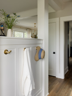
The entry reveals a view straight back to the kitchen, to the dining room toward the back left and to the living room on the other side of the half wall seen here. The door opens to a coat closet.

“The one thing my client really wanted in here was hooks for her friends to hang their purses up,” Stroud says. This keeps them off her kitchen counters.

“The house was sinking. The foundation needed to be jacked up and the floors needed to be leveled,” Stroud says. This meant replacing all the flooring. The new hardwoods create consistency throughout the first floor, add warmth and suit the home’s age.

Find an interior designer on Houzz


This article was originally published by a
www.houzz.com . Read the Original article here. .


Peregrine Design BuildSave Photo
Photos by Ryan Bent Photography

Kitchen at a Glance
Who lives here: A couple with four kids
Location: Shelburne, Vermont
Size: 353 square feet (33 square meters)
Designers: Jillian Bartolo of Peregrine Design Build (lead designer) and Lauren Miles (interior design)

Bartolo removed a structural wall to absorb the former dining room into the new kitchen, increasing the layout by 155 square feet. “We ended up relocating the dining room across the house,” says Bartolo, who worked with Miles on selecting finishes.

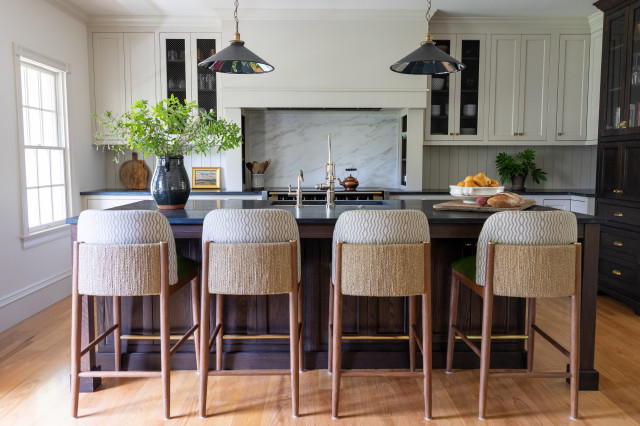
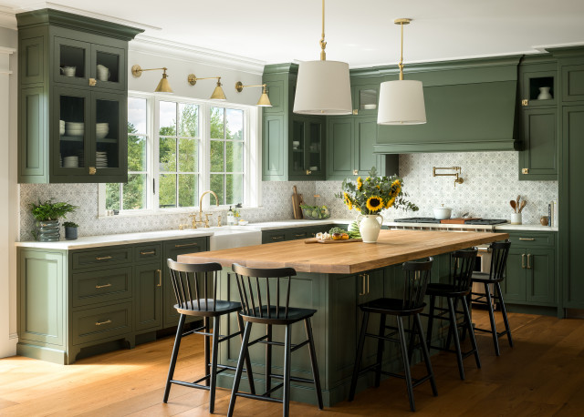
A 4½ -by-10-foot island with a flat-sawn white oak countertop creates a warm and welcoming spot for the family to gather. “It was my recommendation to go with a 2-inch-thick top that’s dramatic and creates a focal point,” Bartolo says. “For the scale of the island that big, the thickness is appropriate.”

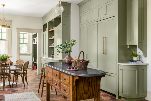
Custom Shaker-style wood cabinetry is painted a warm green (Shade-Grown by Sherwin-Williams). A 36-inch paneled built-in refrigerator column and 30-inch paneled freezer (back right) and paneled dishwasher to the left of the sink help maintain the warm and inviting look. The wood-and-green palette join engineered wide-plank European white oak flooring, hand-painted marble backsplash tiles and marble perimeter countertops for an inviting English country look and feel.

A pocket door next to the refrigerator leads to the renovated mudroom, which has slate tile flooring. To the right of that doorway, on the white wall, is another pocket door (not shown) that opens to a spacious butler’s pantry.

Backsplash: Willow in Walnut, Artisan Stone Tile, StoneImpressions; paint colors: Ivory White (ceiling and trim) and Tapestry Beige (walls), Benjamin Moore; cabinetry: Pomerantz Woodworking; flooring: Tresor collection, Provenza Floors

Find kitchen remodelers near you


This article was originally published by a
www.houzz.com . Read the Original article here. .


John Davies LandscapeSave Photo
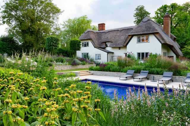
It’s a stunning site, surrounded by woodland and mature trees, which Davies pulled into the design as borrowed views. The new pool sits low in the landscape, and Davies layered perennials, shrubs and more trees into the banks of the slopes, which he manipulated into terraces.

Plants here include ‘Caradonna’ sage (Salvia nemorosa ‘Caradonna’, USDA zones 4 to 9; find your zone), lamb’s ears (Stachys byzantina, zones 4 to 9), white Jupiter’s beard (Centranthus ruber ‘Albus’, zones 5 to 8) and ‘Walker’s Low’ catmint (Nepeta racemosa ‘Walker’s Low’, zones 3 to 8).

“I call this the Carpinus bank,” Davies says, referring to the row of five box-pruned hornbeams that punctuates the stretch. The clipped trees echo the thatched roof. “There’s a sense of the thatch being a clipped material,” he says.

Note: Lamb’s ears and Jupiter’s beard can be aggressive spreaders, depending on where you live and your garden’s conditions. Check with a landscape designer or your local nursery before planting.


This article was originally published by a www.houzz.com . Read the Original article here. .
Pin It