![]()
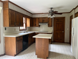
This retired couple in Washington state were ready to trade the cramped, dated kitchen in their 1990s split-level home for something brighter, smarter and more functional. Basic maple cabinets fell short on storage, and a bulky two-tier island made walkways uncomfortably tight. While skylights and a nearby sliding door offered some natural light, the lack of a window left the space feeling dark.
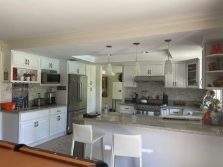
Designer Molly Erin McCabe guided the couple beyond their initial idea of a light refresh to a full remodel that reconfigured appliances, opened up circulation and brought in a garden view. Warm cherry cabinetry now stretches to the ceiling, maximizing storage and beautifully complementing a soft blue backsplash. A sleek single-level island creates better flow, while a new bar area with a beverage fridge improves entertaining.
Before Photo
Frameless cherry cabinets with a warm brown stain extend to the ceiling, maximizing storage. “It was configured for how the clients live and how they cook,” McCabe says. “My objective was to create storage that was inside the kitchen, to minimize trips into the pantry. The cherry also has a richer tone.”
The cabinetry pairs with the existing red oak floor, which was patched with new boards where the island was moved and then refinished with a matte urethane coat. “Because we moved the island, we had to weave in new boards,” McCabe says. “We kept the project cost down by only having to refinish the floor in the kitchen.”
Cabinetry: Bria cabinet line in door style Carson in cherry with Toast stain, Dura Supreme Cabinetry; wall paint: Comfort Gray, Sherwin-Williams
Find kitchen remodelers near you
Before Photo
Before: The blue-and-wood two-tier island with overhang and stools crowded the adjoining breakfast area. The black tile backsplash paired with a black propane cooktop and inefficient downdraft vent made that side of the kitchen feel especially dark. The two fixed skylights were incorporated into the new design.
A 30-inch built-in induction cooktop in black glass replaces the former propane unit in roughly the same location. It’s paired with a wall-mounted stainless steel hood that improves air quality and helps keep surfaces clean.
For the backsplash, McCabe used handcrafted glazed ceramic blue picket tiles with tonal variation and light gray grout. “The blue tile in the backsplash ties in the blue hue that flows through the home, and the scale of the tile adds interest without creating visual clutter,” she says. A paneled door on the left leads to an existing walk-in pantry.
Backsplash tile: Watercolors picket in Whitney, Lunada Bay Tile; counters: Swanbridge, Cambria; hardware: Amwell in Ash Gray, Top Knobs
Before and After: 4 Appealing Kitchens in 300 Square Feet
Before Photo
Before: This view shows the interior side of the former island, which held a white double-bowl sink, sink cabinet and dishwasher. “There was no space to the right of the sink, which created a hazard,” McCabe says.
A black wall oven and a small black microwave sat next to the refrigerator alongside a short run of cabinetry and counter that ended just before the sliding glass door. “There was about 11 inches or so between the casing of the door and the cabinetry,” McCabe says.
The new undermount workstation sink in brushed stainless steel features a motion-activated smart pull-down faucet with a spot-resistant finish. “The plumbing from the island was rerouted through the floor joists to that wall,” McCabe says. “There’s a whole floor of the home below. Running the plumbing through the floor joists was instrumental to keep the costs down. The workstation sink effectively creates more counter space and makes food prep a breeze with multiple accessories.”
The couple’s existing top-control stainless steel dishwasher was reinstalled to the right of the sink. A valance above integrates LED pods for task lighting, and the updated plan also includes new ceiling LEDs and glass bulb pendant lights over the breakfast table.
See why you should hire a professional who uses Houzz Pro software
Before Photo
Before: Across from where the refrigerator and wall ovens were, a short run of cabinetry and counter went largely unused. “The cabinets there were only 21 inches deep instead of 24,” McCabe says. Nearby, a desk area by the dining table often became a dumping ground. “They wanted a beverage center,” McCabe says.
The former desk area became a bar, featuring an undercounter beverage refrigerator and cabinets for storing spirits and entertaining supplies. “The beverage fridge and countertop help keep guests close by when entertaining, without making them feel like they are in the way,” McCabe says.
New to home remodeling? Learn the basics
Before Photo
Before: The former kitchen felt smaller than its actual size due to the shape and placement of the two-tier island (center), which made walkways tight, especially between the island and dining table (bottom right).
The refrigerator and wall ovens (bottom left) were positioned along the exterior wall, while the desk (top right) and a short run of cabinetry and counter (top left) sat across the room. The cooktop was on the left, opposite the island sink.
More on Houzz
Read more kitchen stories
Browse kitchen photos
Hire a kitchen remodeler
This article was originally published by a www.houzz.com . Read the Original article here. .


Kitchen at a Glance
Who lives here: A recently retired couple
Location: Kingston, Washington
Size: 280 square feet (26 square meters), including a breakfast area
Designer: Molly Erin McCabe of McCabe by Design
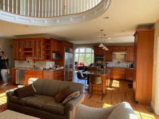
Before: This view from the living room shows the former kitchen in the background. While the size of the open layout was adequate, short basic maple cabinets without knobs or pulls offered little storage or style. Granite tile counters and a black tile backsplash paired with a mix of black and stainless steel appliances felt dated. The bulky two-tier island cramped circulation. “It was probably the first thing out of my mouth,” McCabe says. “They didn’t have sufficient aisleways.” A breakfast area with a wood table and chairs and a sliding glass door to a deck connected the kitchen and living room.