Tag

Blue

Browsing


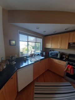
Before Photo

Tara Lenney DesignSave Photo

“After” photos by Steven Lenney

Kitchen at a Glance
Who lives here: A couple with two kids — one in college and one still at home — and a labradoodle
Location: Richardson, Texas
Size: 430 square feet (40 square meters)
Designer: Tara Lenney Design

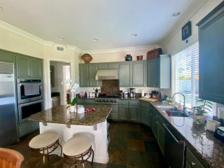
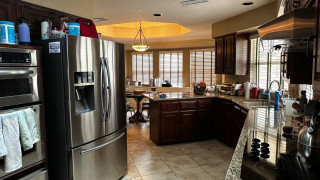
Before: The dreary, chopped-up, 310-square-foot kitchen had dark oak-stained cabinetry, granite countertops in brown, tan and black, and a beige ceramic tile floor. It also had what Lenney describes as “the world’s weirdest shape.” A black electric cooktop sat on an angled wall to the right, while a stainless steel double-bowl sink was positioned beneath two windows. (Take note of the window near the sink to help orient the view in the following “after” photo.)

A large stainless steel refrigerator protruded past surrounding cabinetry along a wall backed by a centrally located laundry room (see the before-and-after floor plans below) and was squeezed next to a pair of wall ovens. The laundry room further divided the kitchen from the closed-off dining room and sunken living room.

In the background, a short peninsula cut the kitchen off from the breakfast area and a den. “It was very uninviting,” Lenney says. “Everything was spread out in weird locations. It was also like a hallway. You’re trying to get your cooking done and there are literally people walking through your cooking area. If you were in the kitchen, you couldn’t be where anyone else was because of the layout.”

Find a kitchen designer on Houzz


This article was originally published by a
www.houzz.com . Read the Original article here. .


Purple Cherry Architecture & InteriorsSave Photo

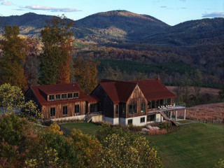
Cherry layered in color through textiles, artwork and furnishings she collected over about five years. She made several trips to Schwung, a creative studio in High Point, North Carolina, to select antiques such as the carved door on the left. At Asia Minor Carpet, she purchased Turkish rugs that bring pattern and warmth to the floors.

Keeping the budget balanced required careful choices. “I really wanted Cor-Ten steel for the roof, and my husband really wanted [radiant-heat] floors,” Cherry says. To offset the costs of those elements, she used a commercial-grade large-format floor tile that mimics rustic wood throughout the main level. It was affordable and is durable enough to handle the dogs that fill the house — five regularly and three more when their son visits.

Other savings came from buying light fixtures from Visual Comfort on sale, cutting the number of recessed lights in half, choosing budget-friendly appliances and skipping smart home features. Cherry also found large pieces — such as the cabinet on the right side of the hallway — during a major sale at Restoration Hardware.

“Everything on the floor was 80% off, and with my trade discount it was 90%,” she says. Those savings left room in the budget for the features that mattered most to her and her husband, including the Cor-Ten steel roof and radiant floor heating throughout the home.


This article was originally published by a
www.houzz.com . Read the Original article here. .


Before Photo

William Adams DesignSave Photo

“After” photos by Tatiana Sokolova of Capture Studio

Kitchen at a Glance
Who lives here: A retired couple
Location: Alameda, California
Size: 285 square feet (26 square meters)
Designer: William Adams Design

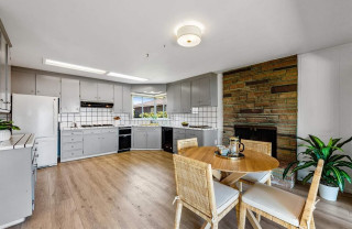
Before: The former 165-square-foot kitchen felt dated and inefficient with aging gray cabinets, mismatched white and black appliances, wood-look vinyl flooring and no island. A corner sink beneath two front-yard-facing windows anchored the layout. “I just felt like that corner sink was dated,” Adams says. “It also took up so much space by the way it was positioned.”

Without an island, storage and prep space were limited and the center of the room felt like wasted territory. An eating area with a large fireplace sat just off the kitchen. “Having that giant fireplace inside the kitchen made no sense at all,” Adams says.

White ceramic tile with dark grout wrapped the countertops and backsplash, creating a dingy look and maintenance the couple didn’t want. Lighting was also a problem: A single ceiling fixture plus a couple of fluorescent task lights left the space poorly illuminated. “The lack of light was not conducive for working in the kitchen or doing everyday tasks,” Adams says. “They enjoy cooking and entertaining and there wasn’t enough space in that footprint to contain what they needed. The cleanliness with those countertops was also an issue.”


This article was originally published by a
www.houzz.com . Read the Original article here. .


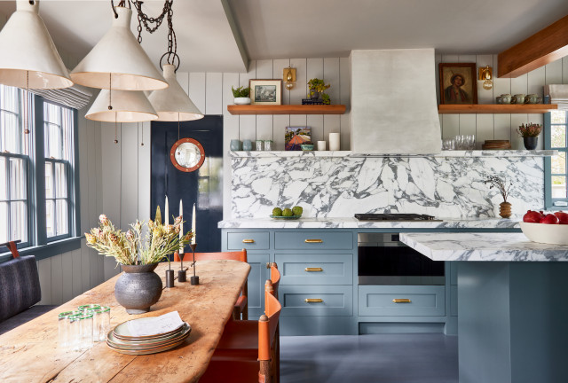
After: The kitchen retains its original footprint, but custom inset cabinets in a smoky blue-gray (De Nimes by Farrow & Ball), paired with boldly veined marble countertops and backsplash, create a striking design statement. The floor, stained gray, grounds the space with subtle sophistication.

McQuaide wrapped the ceiling beam in reclaimed oak and flanked the matte plaster hood with matching wood shelves, adding warmth and texture. Playful nods to the island’s maritime past infuse character throughout the home, including a charming “porthole” on the galley door — actually a convex antique mirror wrapped in leather.


This article was originally published by a www.houzz.com . Read the Original article here. .


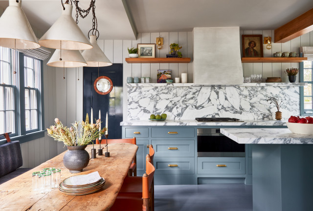
After: The kitchen retains its original footprint, but custom inset cabinets in a smoky blue-gray (De Nimes by Farrow & Ball), paired with boldly veined marble countertops and backsplash, create a striking design statement. The floor, stained gray, grounds the space with subtle sophistication.

McQuaide wrapped the ceiling beam in reclaimed oak and flanked the matte plaster hood with matching wood shelves, adding warmth and texture. Playful nods to the island’s maritime past infuse character throughout the home, including a charming “porthole” on the galley door — actually a convex antique mirror wrapped in leather.


This article was originally published by a www.houzz.com . Read the Original article here. .



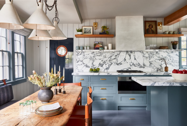
After: The kitchen retains its original footprint, but custom inset cabinets in a smoky blue-gray (De Nimes by Farrow & Ball), paired with boldly veined marble countertops and backsplash, create a striking design statement. The floor, stained gray, grounds the space with subtle sophistication.

McQuaide wrapped the ceiling beam in reclaimed oak and flanked the matte plaster hood with matching wood shelves, adding warmth and texture. Playful nods to the island’s maritime past infuse character throughout the home, including a charming “porthole” on the galley door — actually a convex antique mirror wrapped in leather.


This article was originally published by a www.houzz.com . Read the Original article here. .


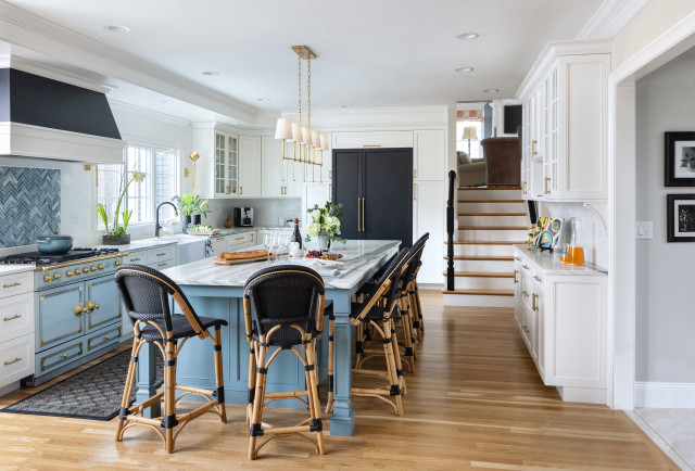
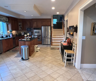
There were a number of reasons this Massachusetts couple purchased their Colonial Shingle-style home in 2004. But the kitchen wasn’t one of them. The space was a good size and included a breakfast area, but a tiny island without seating, a cramped appliance setup and dark and dated finishes didn’t give these foodies the stylish and welcoming kitchen they dreamed of.

Parents of three now-grown sons, the couple were finally ready to make serious changes. They hired designer Jodi Swartz to help improve both function and style. While the overall layout stayed mostly the same, two-tone custom cabinets in a classic white for the perimeter and a robin’s-egg blue for the expansive island give the kitchen a fresh look. A dual-fuel range in a soft shade of blue and blue backsplash tiles complement the island. Touches of black add dramatic contrast. Elegant marble countertops, warm oak flooring and a cozy seating area near a fireplace elevate the kitchen with timeless appeal.


This article was originally published by a www.houzz.com . Read the Original article here. .


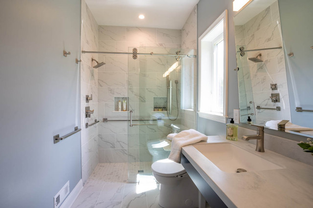
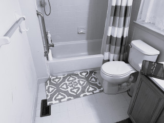
This retired couple wanted to ensure their home could address any future needs for themselves or family members, including an adult live-in son with special needs. They turned their attention to an in-law-suite bathroom that they felt could best benefit from universal design updates.

For help, they brought on designer Grace Arndt, who was helping them remodel their kitchen with similar principles. Arndt ditched a shower-tub combo in favor of a curbless shower that’s easy to enter for someone with mobility issues. A sliding glass door can easily be removed and replaced with a shower curtain that allows access for a wheelchair and a caregiver. A new double vanity has room under the sink to accommodate a wheelchair; tilted mirrors can be used by someone seated as well. Grab bars and rounded countertop corners also support aging in place. Meanwhile, light blue walls, a dark blue vanity and marble-look porcelain tiles in various sizes make the space as stylish as it is functional.


This article was originally published by a www.houzz.com . Read the Original article here. .


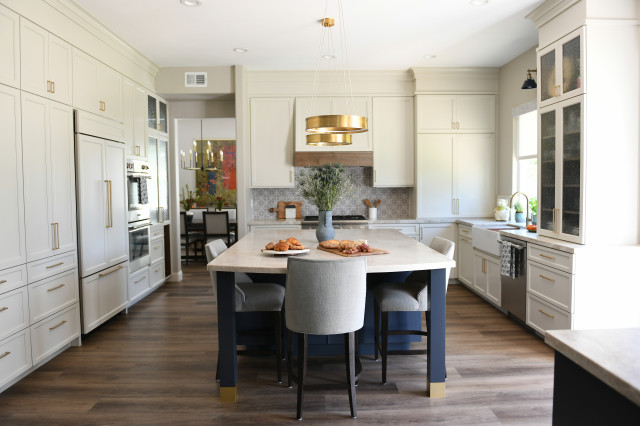
This couple lived in their upscale Carlsbad, California, tract home for nearly 25 years wondering what to do about their aging kitchen. They just couldn’t decide on the style and layout changes they should make to create the warm and welcoming look and feel they wanted. Eventually, they went on Houzz in search of a local professional designer who could help them make the right choices. Impressed with the projects and reviews on Lori Ramsay’s Houzz profile, the couple hired her and got to work.

Ramsay brightened and softened the space with warm creamy beige perimeter cabinets that increased storage and organization. A large navy blue island adds storage, style, work surface and seating for three people on three sides, which allows for face-to-face conversation. Incorporating a small butler’s pantry helped streamline the cabinetry layout. Ditching a dining table loosened up the space, while relocating a built-in desk let Ramsay add French doors that improve connection with the yard.


This article was originally published by a www.houzz.com . Read the Original article here. .


McGuire + Co. Kitchen & BathSave Photo
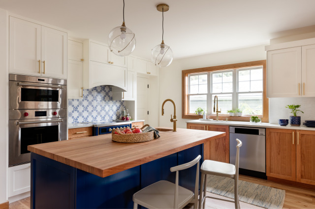
After: Jacobs took the kitchen down to the studs, removed a bulkhead and some upper cabinets and added 97 square feet by taking space from a butler’s pantry and a breakfast area. That created a more open feel even with the addition of an island with two seats.

A blue glass pendant light that previously hung in the breakfast area inspired the new look and balances all the clean lines with its vintage silhouette. Artwork and backsplash tiles in shades of blue and green complement the pendant and play nicely with cherry cabinets. The cabinets are a flat-panel style with horizontal pulls, conveying a midcentury vibe.

This photo was taken from where the fridge is in the next photo.

Backsplash tile: Natural Hues collection in Rain, Ireland and Starlight, Daltile; cabinets: Seaside in natural cherry, Tedd Wood


This article was originally published by a
www.houzz.com . Read the Original article here. .
Pin It