Adjusting living spaces as we age is a smart move: extra light here, less slip risk there, and who wants to spend more time than necessary scrubbing anything? In these four baths, designers considered all of that and then kept going, swapping out hazardous tubs for roomy showers, clearing floor space for wheelchairs and walkers and installing safety features such as grab bars. And of course, they waved the beauty wand too, creating spaces that are a joy to be in. Have a look, then let us know in the Comments if you’re inspired to borrow any ideas.
Before Photo
Countertop: Pure White, Caesarstone
Find a bathroom designer on Houzz
Tub surround tiles: Origines Or glossy, 24 by 48 inches, Elysium; shower fixtures: Litze in Brilliance Luxe Gold, Brizo
Read more about this project
Before Photo
Bathroom at a Glance
Who lives here: A pair of empty-nest retirees
Location: Davis, California
Size: 125 square feet (12 square meters)
Design team: Penny Lorain (design) and Matthew Laughlin (project management) of Lorain Design Associates
Builders: Nader Faris and John Rieboldt of AMA Construction
Before: These retiree homeowners in California’s Sacramento Valley wanted to stay put for the long term, so their dated bathroom, with its chopped-up layout, monolithic tub and lack of accessibility, had to go. They brought on Penny Lorain and Matthew Laughlin of Lorain Design Associates to redesign the space for better mobility, ease of use and airy good looks.
See why you should hire a professional who uses Houzz Pro software
After: The team knocked everything back to the studs and got rid of a water closet in front of the old shower, opening up the space. (The toilet is now in an open area at the front right, out of frame.) Then it rejiggered the layout, creating a spa-like bath with a curbless wet-room-style area at one end. Aging-friendly features include wheelchair and walker maneuverability, ADA-compliant grab bars by the tub, grooved floor tiles that help prevent slippage, and a lower sink and makeup area with wheel space below. Style-wise, wood-look porcelain wall and floor tiles, along with polished blue glass accent tiles, create a warm, organic feel and help the existing vaulted ceiling stand out.
Shower wall tiles: Cypress in Natural, 9 by 48 inches, Happy Floors; floor tiles: Elan Ribbon Maple, 24 by 48 inches, Soho Studio; blue accent tiles: Brook Stacked in Sky, Soho Studio
Read more about this project
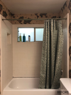
Before Photo
3. Clear and Bright
Bathroom at a Glance
Who lives here: A couple of empty nesters
Location: Inver Grove Heights, Minnesota
Size: 105 square feet (9.8 square meters)
Designer: Stefanie Cohoe of Che Bella Interiors Design + Remodeling
Before: When one of them started using a wheelchair, these Minnesota homeowners tapped designer Stefanie Cohoe of Che Bella Interiors Design + Remodeling to redo their primary bath based on ADA standards. One big to-do: widen the too-narrow main door and shower door openings for maneuverability. While she was at it, Cohoe took the space from uninspired and a bit dark to polished and bright.
Paint: Gossamer Veil (walls) and Pure White (cabinets), Sherwin-Williams
11 Ways to Age-Proof Your Bathroom
Read more about this project
Before Photo
Bathroom at a Glance
Who lives here: A couple in their 70s
Location: Newton, Massachusetts
Size: 69 square feet (6.4 square meters)
Design-build firm: Steveworks
Before: Although its first-floor location was ideal for the aging homeowners, this bathroom in their 1923 New England Craftsman had a hard-to-navigate tub-and-shower combo. Could design-build firm Steveworks give them a zero-threshold shower and some safety features, as well as a washer-dryer so they could avoid basement treks? Yes indeed, and with a sweet new look to boot.
After: The new walk-in shower has a sliding barn door that’s wide enough for a walker, with a large handle, as well as a built-in seat and an adjustable handheld shower head. Steveworks’ Tova Greenberg moved the sink from that corner to make way for the roomier shower and a petite all-in-one washer-dryer unit on a pedestal next to it. Slip-resistant flooring, ample lighting and a grab bar by the toilet boost safety too, while botanical wallpaper (April Blossom by York Wallcoverings) and lots of white update the room’s style.
Oh, and that original radiator? Yes, it takes up some floor space, but it has charm and does important work keeping the space toasty on cold days. The Steveworks team just refinished it so it would fit the fresh look.
Read more about this project
Your turn: Does your bath support aging in style? Show us in the Comments.
More on Houzz
Read more bathroom stories
Browse bathroom photos
Find a bathroom remodeler
This article was originally published by a www.houzz.com . Read the Original article here. .


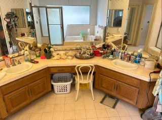
1. Elegant and Open
Bathroom at a Glance
Who lives here: A couple and the wife’s elderly mother
Location: Laguna Niguel, California
Size: 185 square feet (17 square meters)
Designer: Janna Parr of Sea Pointe Design & Remodel
Before: Stuck in the 1970s, hard to clean and with insufficient storage, this Southern California primary bathroom also lacked safety features to support the elderly mother of one of the homeowners. It had a shower and tub atop a slip-prone step, for instance, and no shower niche, meaning products lined the floor. Designer Janna Parr of Sea Pointe Design & Remodel came up with a plan to make the space modern, streamlined and safer while adding stylish storage.