
![]()
Location: Maple Grove, Minnesota
Size: 50 square feet (4.7 square meters)
Homeowners’ request. “This bathroom is shared by three teenage girls,” says interior designer Victoria Johnson. “The parents reached out wanting to maximize storage and give the space a more elevated, timeless look.”
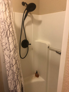
Shower-tub combo. “The homeowners chose to keep the shower-tub combo primarily for resale value, as families with young children often prefer having a tub,” Johnson says. “Plus, their teenage daughters still enjoy using it. To make the setup more functional, we designed a wall-to-wall niche large enough to hold all their hair products, soaps and razors neatly. We also added a hand shower, which serves both as a spa-like feature and a practical one — it’s perfect for washing their beloved dog.”
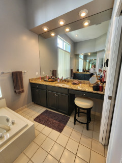
Other special features. “Everything in this bathroom was designed around the idea of three — one for each daughter,” Johnson says. “We installed a triple medicine cabinet, which we purchased on Houzz, so each girl has her own section. We also designed a custom recessed cabinet between the studs, again divided into three compartments for individual storage. The custom vanity features a single sink to maximize counter space, a decision that has proven incredibly functional for busy mornings.” The countertop is Taj Mahal quartzite.
Designer tip. “There are three features I absolutely love here,” Johnson says. “First, the wall-to-wall niche. It’s such a simple upgrade that dramatically improves usability, and I’ll likely do this in every project moving forward. Second, medicine cabinets. There are so many beautifully designed options now and the hidden storage they provide is invaluable. Third, when space is tight, adding recessed cabinets between studs is a clever way to gain storage without sacrificing floor space.”
Wall color: Pearly White, Sherwin-Williams
This article was originally published by a www.houzz.com . Read the Original article here. .


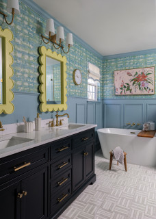


4. Elevated Classic
Bathroom at a Glance
Location: Franklin, Tennessee
Size: 180 square feet (17 square meters)
Design-build firm: Sebring Design Build
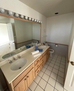
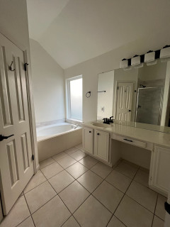
Before: These Franklin, Tennessee, homeowners turned to Sebring Design Build to update their primary bathroom. Although spacious and featuring two vanities, the layout felt chopped up and cramped. A toilet room sat to the right of one vanity, while a shower stall and second vanity flanked the opposite end of the bathtub.
The couple didn’t want a bathtub and asked for a layout based on universal design principles, including a wheelchair turning radius. They also envisioned a clean, elevated traditional style with a spa-like, airy feel.
New to home remodeling? Learn the basics