Tag

Bathroom

Browsing


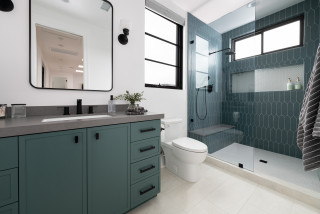
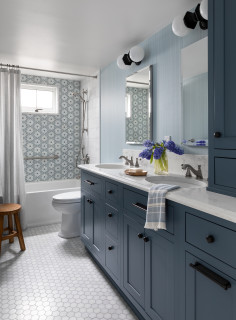
After traveling the world and having three kids, these homeowners were ready to settle down in their forever home. They asked designer Taylor Harrison to create a second-floor addition that includes an elevated yet kid-friendly hallway bathroom for their young son and occasional overnight guests.

Harrison responded with an efficient setup in 70 square feet that includes a hardworking single-sink vanity, a toilet and a roomy low-curb shower. The couple referenced inspiration photos they saw on Houzz when deciding on a fresh and clean style. Glazed blue-gray ceramic wall tiles wrapping the shower complement the blue-green paint on the vanity. Large-format matte white porcelain floor tiles and white walls help reflect light and visually expand the room. A gray quartz countertop and matte black plumbing fixtures and other details lend a touch of modern flair.


This article was originally published by a www.houzz.com . Read the Original article here. .


Catherine Schager DesignsSave Photo
7. Install Full-Extension Slides, Soft-Close Hardware and Rollout Shelves

Functional hardware is a bonus upgrade with one of the greatest rewards. Your drawers can be pulled out completely with full-extension slides, allowing an entire view of and access to the drawer. Items in your drawer won’t be hidden, and the drawer may be easier to clean as well. Even if your remodel includes keeping your existing drawers and cabinets, most can be easily retrofitted with full-extension slides.

Soft-close slides and hinges prevent drawers and cabinet doors from slamming shut, instead closing them softly and silently. This not only reduces noise but also minimizes wear and tear on the drawers, doors and hinges and prevents contents from shifting too much. Additionally, soft-close slides can help keep children’s fingers from getting pinched by a fast-closing drawer.

For deep cabinets, items stored in the back may be awkward to retrieve and therefore become lost and forgotten. I recommend rollout shelves (with full-extension slides, of course) in these spaces so you can see all the contents. Since access is much more convenient, you may be encouraged to put things away properly and more efficiently.


This article was originally published by a
www.houzz.com . Read the Original article here. .


These homeowners disliked the mostly brown and tan finishes and bulky features in their primary bathroom. The couple’s designer, Chad Esslinger, describes the space a bit more bluntly. “Outdated and dismal,” he says.

To freshen up the look and feel, the couple created an ideabook on Houzz, with inspiration photos they shared with Esslinger. He worked within the same basic footprint but ditched all the former materials and components. Lots of light and bright finishes brighten the space. Esslinger used the same marble tile in various areas, but to create visual interest and texture he played with pattern and shape — hexagons behind the tub, herringbone on the floor, large-format rectangles in the shower. Deep blue vanities and brass details elevate the style.


This article was originally published by a www.houzz.com . Read the Original article here. .


Terri Brien InteriorsSave Photo
The new curbless shower with a custom half-inch-thick frameless glass enclosure gives the room a light and airy feel. “The shower they had before wasn’t curbless,” Brien says. “All the fixtures were quite a bit lower. The husband is 6 foot, 5 inches and the wife is about 5 foot, 3 inches, so we have the handheld shower significantly lowered for her and the shower head higher for him. Previously, they also didn’t have any shampoo niches or that footrest.” The solid brass fixtures are in a satin bronze finish that adds warmth and coordinates with other finishes in the room.

The same tiles used for the backsplash wrap the upper portion of the walls. Below ¾-inch step molding are 12-by-24-inch Mystery White marble tiles. “The Mystery White happens to be really well-priced and has some warmth running through it,” Brien says. “That warmth coordinates with the warmth you see in the Taj Mahal.”

The pale beige hexagonal stone floor tile continues seamlessly into the shower. “The walls are neutral, so I wanted to mix up the textures and materials to add more interest and depth,” Brien says.

New to home remodeling? Learn the basics


This article was originally published by a
www.houzz.com . Read the Original article here. .


Decades ago, iconic American interior designer Dorothy Draper said: “The Drab Age is over. Color is coming into its own again.” The declaration is as timely now as it was then, especially for this homeowner. She, her husband and their two kids share one full bathroom on the second floor of their 1920s Tudor-style home in Royal Oak, Michigan. In spite of its modest footprint of 40 square feet, she had a “more is more” attitude, which was fully embraced by her interior designer, Emily Elkins.

“This client came to me armed with a PowerPoint presentation,” Elkins says. “This is only the second time a client has done that, and I loved this one. It had a lot of references to Dorothy Draper, who designed the Grand Hotel on Mackinac Island and The Greenbrier in West Virginia. I personally love traditional style and color too, and I’m kind of a ‘more is more’ person. The more layers, more colors, more details, the better the design is.”


This article was originally published by a www.houzz.com . Read the Original article here. .


Nightingale Co.Save Photo
To arrive at the new layout, Nightingale took into account the existing confines of the space, such as the ceiling height and window location, and design requirements such as points of egress, walkway widths and minimum shower requirements. He also factored in the separate vanities. (The mirror above the second vanity is reflected in this mirror.) By the time those points were considered, this new configuration emerged as the most functional and efficient solution.

While keeping plumbing in the same spots is often cited as a way to keep costs down, Nightingale cautions that function and layout should always be the top priorities. “If you need to save, save on the finishes, because those are easy to fix or replace later. Not having a good layout is not something you can surmount cost-effectively,” he says.

Plus, moving all the plumbing versus leaving it as is might not be as expensive as you think, Nightingale says. For his company, $1,000 to $1,500 is typical. “On top of that, now you also have brand-new shutoff valves and you have new drains,” he says. “And you can get a lot of extra benefits besides just increasing function and making it more aesthetically pleasing. You also now have the peace of mind that you just put all this money and finishes into a bathroom and it’s going to last.”


This article was originally published by a
www.houzz.com . Read the Original article here. .


Kirk Riley DesignSave Photo
The shower accent wall consists of Carraro Blanco and Thassos marble mosaic tiles with touches of blue. “They were the inspiration for the bathroom,” Kirk says. “We played off that hexagon shape for other parts of the room. A subtle repeat of shapes and colors throughout the room makes the bathroom feel comforting.”

A 24-inch stainless steel grab bar on the back wall offers support for those entering and exiting the tub. The shower-tub combo also includes a pressure-balanced valve system, hand shower, integrated diverter tub spout and a white acrylic tub. A custom operable window brings in fresh air. Surrounding the window is 2-by-12-inch ogee molding in Apollonia marble in a honed finish. “We knew we wanted to add this hall bathroom, but then realized it would be lovely to add that window,” Kirk says. “It really brightens the space.”

The bathroom walls are covered in a blue nonwoven wallpaper with a cloth-like pattern that pairs wavy horizontal lines with straight vertical ones. “It gives you the look and appearance of linen, but it’s more durable and appropriate for a bathroom,” Kirk says.

An ADA-compliant chair-height toilet has an elongated bowl for extra comfort. “I love that this toilet is one piece and skirted for easy cleaning,” Kirk says. A teak bench offers a spot for resting towels or a book while soaking in the tub.

Accent wall tile: Aliso hexagon in blue on Carrara Blanco, StoneImpressions; grab bar: 24-inch in Brilliance Stainless, Delta; teak bench: Sage Interiors; toilet: St. George, DXV; tub: Archer, Kohler; wallpaper: Linen Strie in blue, York Wallcoverings

8 Golden Rules of Bathroom Design


This article was originally published by a
www.houzz.com . Read the Original article here. .


An overabundance of tan and brown finishes and a large built-in tub made for a drab and heavy look in Michael and Yoshie Davison’s primary bathroom. Yearning for a light and airy feel with a fresh style, they turned to designer Shelley Vilov and project manager David Jordan, both of whom had helped the couple update another bathroom in their home.

The remodeling team replaced the built-in tub with a freestanding model that helped loosen up the layout and allow for a bigger shower. White marble-look porcelain tiles cover the floor and the walls wrapping the shower and tub area, creating a brighter look. Pale gray walls also brighten the space, while midtone gray vanities and chrome fixtures and details add touches of fresh, modern style.


This article was originally published by a www.houzz.com . Read the Original article here. .

Pin It