
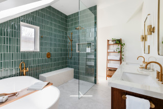
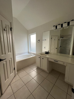
When this Canadian family started to outgrow its home, the last thing it wanted to do was leave behind its beloved neighborhood in Victoria, British Columbia. “This is a fantastic neighborhood that’s walkable to shops, restaurants and the beach,” Robbyn McDonald of MAC Reno Design Build says. “We finished the attic to create space for a primary suite and living room. They’d never had an en suite bathroom before, so they were really excited.” The new, light-filled bathroom is a fresh take on midcentury modern style.
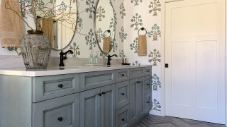
Simple mirrors with rounded edges maintain the clean look. The room has a lot of straight lines, so the subtle curves of the mirror frames add softness.
The countertop is a porcelain slab that looks like marble. The designers used the same porcelain on the shower bench. The bench is heated and serves as a toasty seat in the shower.
Browse vanities in the Houzz Shop
The flooring is also porcelain, composed of large-format tiles. The open door offers a glimpse into the primary bedroom. Heated floors keep the bathroom nice and warm.
The shower has a partial enclosure, which keeps the water inside. Tight insulation and energy-efficient glass on the windows and skylight help prevent drafts.
“The vaulted ceiling added height and visual interest, creating a cozy and inviting tub area,” McDonald says. “Positioning the skylight above the tub brought natural light throughout the room, reducing reliance on artificial lighting.”
Shop for a bathtub
Shower tile: Flauti in Sage Gloss, Ceramic Tileworks
“High-quality materials and precise construction techniques ensured the bathroom met industry best practices for sustainability, water conservation and performance,” McDonald says. These include:
Updated plumbing and mechanical systemsWater-conserving shower fixtures Low-E energy-efficient windows that create a tight envelopeHeated flooring that provides even, energy-efficient heatLED lightingPlenty of natural light to reduce use of artificial lighting
This article was originally published by a www.houzz.com . Read the Original article here. .


Bathroom at a Glance
Who lives here: A young family
Location: Victoria, British Columbia
Size: 118 square feet (11 square meters)
Designer-builder: MAC Reno Design Build
The new bathroom includes a double vanity, a generous shower stall, a freestanding bathtub and a private toilet alcove behind the plumbing wall in the shower. The shower has a long bench with a handheld shower wand above it. The shower stall is curbless, so the floor slopes imperceptibly to direct water to a linear drain next to the bench.
To increase the attic space, the firm removed the home’s existing hipped pyramid roof. It framed the walls a few feet higher, then added a new cross-gable roof.
Find a local design-build firm on Houzz