This article was originally published by a www.houzz.com . Read the Original article here. .
This article was originally published by a www.houzz.com . Read the Original article here. .
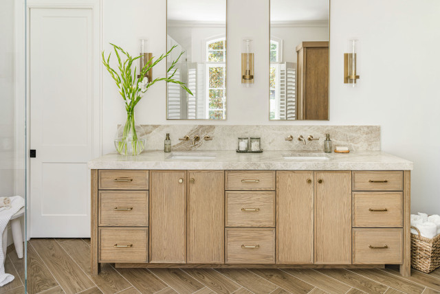
A walnut double vanity helps anchor this updated 56-square-foot Oakland, California, bathroom by William Adams Design. Tall legs create a lighter, more open feel, while the elimination of an old shower stall made room for the 5-foot-long ready-made model with semicustom features. Undermount sinks, gunmetal-finish faucets and marble-look quartz countertops and backsplashes add durability and polish. Combined with abundant natural light and a biophilic mix of materials, the warm wood vanity helps strengthen the room’s connection to nature.
Semicustom double vanity: Room & Board
Read more about this bathroom makeover
This article was originally published by a www.houzz.com . Read the Original article here. .

Bathroom at a Glance
Who lives here: A couple with three kids; this bathroom is used by the oldest daughter
Location: Portola Valley, California
Size: 84 square feet (7.8 square meters)
Design-build team: Roi Omer (builder) and Ofir Omer (designer) of Valley Boutique Builders
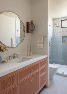
The new en suite bathroom complements the rest of the home while expressing its own personality. “The mom told me she was looking for something modern but not too modern,” Ofir says. “A space that felt eclectic but also fresh and warm. We have color but we were looking for the right combination for the girl, who loves blue and also pink.”
A prefabricated white oak vanity with a reeded front and gold knobs offers ample storage and a timeless look. “Also, the panel fronts fit with the home’s modern Italian look,” Ofir says.
“The vanity is painted a terra-cotta pink, which is a warm, earthy and muted shade that falls between clay orange and dusty rose,” Roi says. “It’s a sophisticated blush tone, not a bright pink, and it leans more toward a refined clay or salmon rose.”
A partition wall to the right creates privacy for the toilet. “In the beginning, we weren’t going to have a wall there, but we wanted to create that separation between the vanity and toilet,” Ofir says.
Walls, ceiling and trim are painted a custom mushroom hue in a satin finish selected for its durability and easy maintenance. “It’s easy to clean, that’s the most important thing,” Ofir says. “I wanted to create good flow and not create any separation between the ceiling and walls.”
Vanity: Sonoma collection, Willow Bath and Vanity
Find home design and building pros on Houzz
This article was originally published by a www.houzz.com . Read the Original article here. .
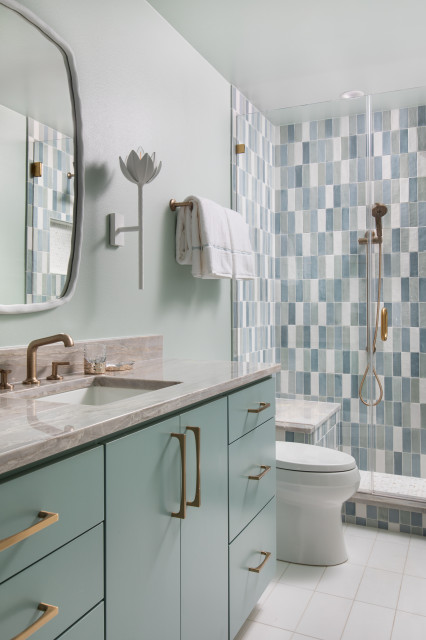
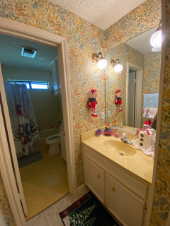
Part of the work involved transforming the dated hall bath with an awkward layout into an en suite guest bath. The owners “had lived in Paris and wanted to bring some of the beautiful style they’d seen there to Texas,” says Realty Restoration project manager Jenny Curtiss. “They loved color and pattern so much that they even wanted to try and save some of the original vintage wallpapers in the house.”
Though necessities like reframing, shoring up walls, moving plumbing lines and bringing the electrical system up to code made that impossible, they hired interior designer Lauren Jerden of Lauren Allyn Interiors to keep the home’s colorful, spirited soul alive.
This article was originally published by a www.houzz.com . Read the Original article here. .
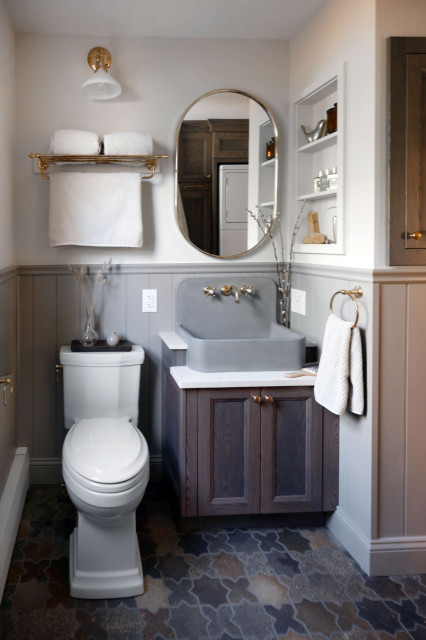
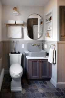
A spacious low-curb walk-in shower now occupies the former site of the side-by-side washer and dryer. “It was pretty obvious the washer and dryer were front and center and the shower was so tiny,” Gordon says. “We had to rescue that space back.”
The shower features a custom glass enclosure with an unlacquered brass finish. On the walls, 2-by-2-inch mosaic zellige tiles crafted from natural Moroccan clay cover the upper half, while 4-by-4-inch moss green zellige tiles from the same manufacturer line the lower half. “When you have a tiny space, you can expand it a bit by creating an illusion that the bottom of the shower is smaller than the top,” Gordon says.
The shower floor is laid in cream-colored honed natural stone mosaic tiles in a jasmine flower pattern with gold dots. The exposed thermostatic shower head with hand shower has the unlacquered polished brass finish found elsewhere in the space. Crema Marfil marble reappears on the shower curb, the built-in corner bench top and as a liner for a long niche. A hook just outside the shower entrance keeps a robe or towel within easy reach.
Wall tiles: Linen beige zellige mosaic, 2 by 2 inches, and Thyme green zellige square, 4 by 4 inches, LiLi Tile
This article was originally published by a www.houzz.com . Read the Original article here. .

Bathroom at a Glance
Who lives here: A couple with two school-aged kids
Location: Santa Cruz, California
Size: 166 square feet (15 square meters)
Designers: Cyndi Mosher and Jennifer Simmons of Beyond the Box Design Collective
Builder: Jared Lewis of Lewis Design-Build-Remodel
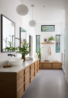
The updated bathroom keeps the original footprint but removing the separate vanities and a tall linen cabinet opened up the layout. In their place, a custom floating bleached walnut double vanity anchors the room, paired with a matching built-in bench with storage drawers along the adjoining wall. “When we looked at different options for the cabinetry, we went with the bleached look that brings out more warmth and the tone of the wood,” Simmons says.
To the left of the bench, a new doorway replaces an aging bifold door and connects to the primary closet. To the right, a newly created wet room enhances the layout.
A restrained palette balances the warmth of wood cabinetry with soft white and gray tones, punctuated by crisp black accents. While the homeowners initially considered earth tones, the vision evolved into a calm, modern retreat with Scandinavian influences that ultimately landed on a Japandi-inspired look. “They like simplicity,” Mosher says.
Light-medium gray porcelain floor tiles in a contemporary 24-by-24-inch format offer a subtle Venetian terrazzo look and continue into the wet room for visual continuity. “They really liked that terrazzo look, and once we looked at different versions, we liked this one with the gray and white,” Simmons says. Existing globe pendant lights the homeowners loved were thoughtfully incorporated into the refreshed space.
The design firm uses Houzz Pro software to manage its business. “We use it to track leads and projects,” Simmons says. “We use the Mood Boards, Selection Boards and Selection Tracker. That gives the builder a consolidated list of all the products in one place.”
Floor tiles: Flake series, Richards & Sterling; cabinetmaker: Schmitz Woodworks; staging for photo shoot: Savannah Gonzales, Eleven Home Aesthetics
See why you should hire a professional who uses Houzz Pro software
This article was originally published by a www.houzz.com . Read the Original article here. .
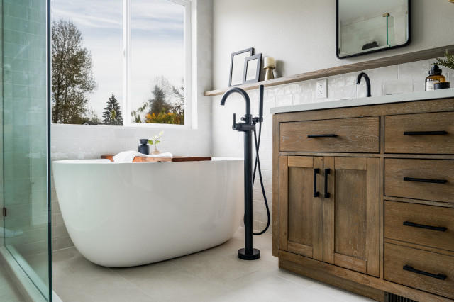
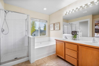
A pair of mirrored medicine cabinets adds storage above the vanity. A ledge running along this wall extends the wood upward, creates a natural stopping point for the backsplash and provides a spot for everyday items and display.
The wife fell in love with the alabaster wall sconce, which introduces a touch of brass. Its oval shape, along with the rounded black mirror frames, softens the room’s strong straight lines.
Wall color: Agreeable Gray, Sherwin-Williams
This article was originally published by a www.houzz.com . Read the Original article here. .
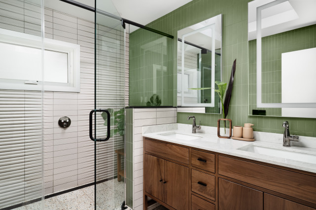
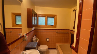
When it came to style, Adams drew on his clients’ lifestyle, their business and the natural character of their neighborhood. He also knew they were world travelers who appreciate clean lines and nature. “They own a product development company and are definitely tactile texture people,” he says. “They live and breathe product development and had a lot of interest in color, texture and pattern.”
The surrounding landscape played a role as well. The neighborhood is filled with trees, and while the homeowners wanted a bold pop of color, they weren’t sure what direction to take. Adams suggested green to echo the natural setting.
10 Top Trends in New Faucets, Sinks, Vanities and More for 2026
This article was originally published by a www.houzz.com . Read the Original article here. .

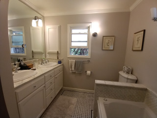
They hired Harrell Design + Build to help them maximize every inch of the 127-square-foot room. By adopting a wet-room strategy for the tub and shower, the team was able to incorporate a larger vanity, carve out a semiprivate toilet area and find space for the new exterior door.
This article was originally published by a www.houzz.com . Read the Original article here. .

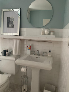
This Canadian couple with two young children found that the kids’ bathroom in their 1919 Tudor-style home in Kitchener, Ontario, was not particularly child-friendly. To add storage, make bath time easier and update the room for modern life, they turned to contractor Tyler Sonnenberg and designer Marissa Warner. Using warm white oak, soft green ceramic tiles, champagne-bronze fixtures and vintage-inspired touches, they created a cheerful space that fits the home’s style and will grow with the kids.
Bathroom at a Glance
Who lives here: A couple and their two young children
Location: Kitchener, Ontario, Canada
Size: 60 square feet (5.6 square meters)
Designer: Marissa Warner of The Home Narrative
Contractor: Tyler Sonnenberg of Sonnarc Homes
Before: The bathroom lacked adequate storage and had a shallow bathtub (just outside of this photo’s frame to the left). It also lacked a handheld shower wand, a practical feature for bathing little ones.
Find a general contractor on Houzz
“Replacing the toilet was the one thing they’d done to this bathroom before we renovated, so we kept it,” Sonnenberg says. Reusing it was another way to keep the budget in check. The standard-height toilet sits lower than a comfort-height model, making it easier for newly potty-trained toddlers to use.
10 Ways To Control the Cost of Your Bathroom Remodel
A compact white oak vanity with a natural finish maximizes the small footprint. Its top drawer is fully functional, and is U-shaped to accommodate the sink’s P-trap. The other two drawers are deep enough to accommodate bottles and larger items such as extra towels.
See why you should hire a professional who uses Houzz Pro software
With heavy-duty hinges, the wood top supports a weight of 75 pounds. Wheels underneath make the drawer easy to slide out, and they retract automatically once it’s fully extended, to prevent rolling. “We also added that little baseboard detail at the bottom to keep the wheels hidden,” Sonnenberg says. The wooden platform is easy to flip up, enabling the drawer to hold items such as towels and extra toilet paper rolls.
Floor tile: Polestar collection, Unicomstarker
The entry door and its hardware are original to the home. A new etched-glass casement window replaced the existing window, letting in more light while providing privacy.
Check out our guide to get started on your home project
Plumbing fixtures: Trinsic in champagne brass, Delta; wall tile: 5-by-5-inch Renzo Jade ceramic tile, MSI Surfaces
5 Stylish New Bathrooms With a Shower-Tub Combo
More on Houzz
Read more bathroom stories
Browse bathroom photos for ideas
Find design and remodeling pros
This article was originally published by a www.houzz.com . Read the Original article here. .

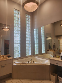
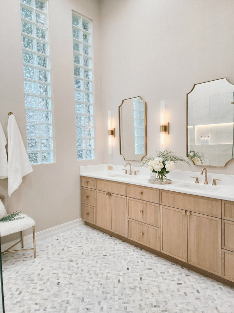
After reviewing the bedroom and the inspiration photos the homeowners shared with her, LaBruna presented a material palette featuring a honed marble herringbone floor tile they loved, slim Shaker-style white oak cabinetry, large-format porcelain tiles that resemble Taj Mahal quartzite and a warm neutral wallcovering. “It was a home run,” she says. Once the plans were finalized, she managed construction over the summer while her snowbird clients stayed at their Pennsylvania home. Their new primary bathroom was ready when they returned in the fall.
On the floor, marble mosaic tile adds an elegant pattern to the calm palette. “We used honed marble because my clients’ biggest priority was making sure the floor was not slippery,” LaBruna says. The copious grout lines between the 1-by-2-inch tiles provide plenty of traction.
Floor tile: Arabescato Venato, MSI Surfaces; wallcovering: Shelter Linen in Pumice, Winfield Thybony Design