Tag

Addition

Browsing


Lifestyle changes like switching to remote work and growing a family can shift functional needs at home. This Boston-area renovation shows how a home can evolve to accommodate new circumstances. Years ago, when their first child was on the way, the owners hired design-build firm J.P. Hoffman to remodel their house. More recently, they welcomed their third child, and both parents began working from home full time. To make their home function better for their current lifestyle, they hired the firm again to create an office addition and remodel the basement, adding a family-friendly TV area, a kids’ playroom, a full bathroom and a guest room.

Before Photo

J.P. Hoffman Design BuildSave Photo

Photos by Lara Kimmerer

Basement at a Glance
Who lives here: A family of five
Location: Westwood, Massachusetts
Size: 800 square feet (74 square meters)
Design-build firm: J.P. Hoffman Design Build

Before: Jason Hoffman of J.P. Hoffman Design Build and Nicholas Preston of Preston Design developed the architectural plans. Jason’s business partner and wife, Megan Hoffman, collaborated with the homeowners on interior finishes and furnishings.

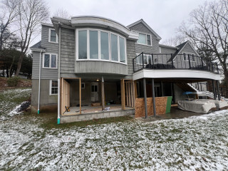
Separate home offices were a priority, but after the couple’s third child was born, the husband’s office became a nursery. His need for a dedicated workspace prompted the basement remodel. The area beneath the curved bay window on the left was a natural fit for the office.

Find a design-build firm on Houzz

After: The 171-square-foot addition encompasses the new office and a small entry area that opens to the covered patio.

Enhancing the covered patio was also part of the project. The firm refreshed and expanded the existing patio, then wrapped the steel structural posts to create stately columns that elevate the rear facade.

The remodeled basement is off the covered patio to the right of the office. Now that the basement is finished, the covered patio gets much more use.

J.P. Hoffman Design BuildSave Photo

“A big must-have for the office was privacy,” Megan says.

J.P. Hoffman Design BuildSave Photo

The office offers lovely views of the homeowners’ landscaped yard and the forested conservation land beyond the property.

The basement floors are luxury vinyl tile in a white oak finish, a low-maintenance material that’s well suited for basements.

Flooring: Summer Oak, Century collection, Stanton

J.P. Hoffman Design BuildSave Photo

“The office is an ode to Boston sports,” Megan says. While one side is for work, this side has a TV for watching the Celtics, the Red Sox, the Bruins and the Patriots, as well as an indoor putting green.

Just outside the office, a small entry area and glass door lead to the patio.

J.P. Hoffman Design BuildSave Photo
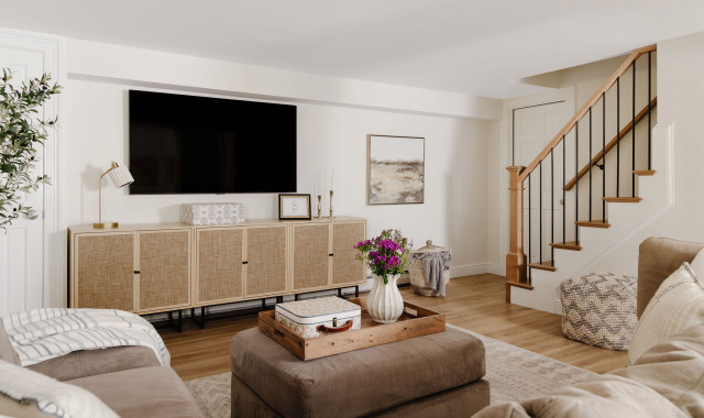
The main part of the basement is dedicated to family time. Having worked with the clients before, the designers already had a strong sense of their transitional style. “Our clients wanted the basement to be super practical, functional and comfortable,” Megan says.

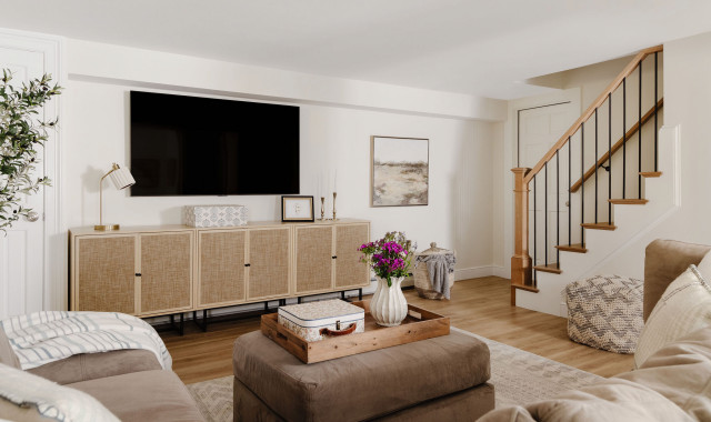
A sectional sofa has room for the whole family, and a long media cabinet holds electronics, games and toys. For quick cleanup, toys, throw blankets and other items can be stashed in the flip-top ottoman.

Wall paint: Alabaster, Benjamin Moore

J.P. Hoffman Design BuildSave Photo
Choosing the furnishings was a collaborative effort between Megan and the homeowners. “I would give them several options and they would make their selections from there,” she says. The process included sharing Houzz photos and creating mood boards with product links.

The home’s sloped site allowed for double-hung windows. Their height maximizes natural light and makes the 7-foot, 2-inch ceilings feel taller. To conceal ductwork above the sofa, Jason created a chase and encased the structural supports below it. The proportions of these elements work well together and provide delineation between the TV lounge and the playroom.

J.P. Hoffman Design BuildSave Photo
The light-filled playroom is a versatile space for the children and their friends. “The kids are really into imaginative play,” Megan says. “They love to create a stage and play dress-up.” The teepee serves as a cozy fort, and there’s a child-size table, not pictured, for crafting and snack time.

The Elements of an Irresistible Playroom

J.P. Hoffman Design BuildSave Photo

A dry kitchen with a beverage fridge serves as a drinks and snack bar. While the homeowners knew they’d use it for the lounge, playroom and office, it also can be used by out-of-town family members staying in the basement guest room.

J.P. Hoffman Design BuildSave Photo
Just past the bar is the guest room, with an original stone fireplace and new closet and windows. Operable casement windows provide required egress and bring in fresh air and light.

To camouflage the ductwork, Jason placed a chase along the left wall and extended the closet framing to meet it, making it look like an intentional part of the architectural design.

J.P. Hoffman Design BuildSave Photo
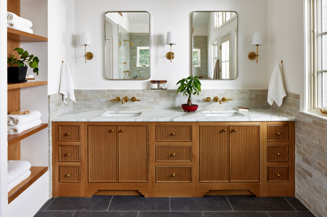
A new bathroom with a shower ensures overnight guests have everything they need on this level. An ornate-framed mirror adds a vintage touch over the white oak vanity.

Wall paint: Sea Salt (50% strength mixed with white), Benjamin Moore


This article was originally published by a
www.houzz.com . Read the Original article here. .


Lifestyle changes like switching to remote work and growing a family can shift functional needs at home. This Boston-area renovation shows how a home can evolve to accommodate new circumstances. Years ago, when their first child was on the way, the owners hired design-build firm J.P. Hoffman to remodel their house. More recently, they welcomed their third child, and both parents began working from home full time. To make their home function better for their current lifestyle, they hired the firm again to create an office addition and remodel the basement, adding a family-friendly TV area, a kids’ playroom, a full bathroom and a guest room.

Before Photo

J.P. Hoffman Design BuildSave Photo

Photos by Lara Kimmerer

Basement at a Glance
Who lives here: A family of five
Location: Westwood, Massachusetts
Size: 800 square feet (74 square meters)
Design-build firm: J.P. Hoffman Design Build

Before: Jason Hoffman of J.P. Hoffman Design Build and Nicholas Preston of Preston Design developed the architectural plans. Jason’s business partner and wife, Megan Hoffman, collaborated with the homeowners on interior finishes and furnishings.

Separate home offices were a priority, but after the couple’s third child was born, the husband’s office became a nursery. His need for a dedicated workspace prompted the basement remodel. The area beneath the curved bay window on the left was a natural fit for the office.

Find a design-build firm on Houzz

After: The 171-square-foot addition encompasses the new office and a small entry area that opens to the covered patio.

Enhancing the covered patio was also part of the project. The firm refreshed and expanded the existing patio, then wrapped the steel structural posts to create stately columns that elevate the rear facade.

The remodeled basement is off the covered patio to the right of the office. Now that the basement is finished, the covered patio gets much more use.

J.P. Hoffman Design BuildSave Photo

“A big must-have for the office was privacy,” Megan says.

J.P. Hoffman Design BuildSave Photo

The office offers lovely views of the homeowners’ landscaped yard and the forested conservation land beyond the property.

The basement floors are luxury vinyl tile in a white oak finish, a low-maintenance material that’s well suited for basements.

Flooring: Summer Oak, Century collection, Stanton

J.P. Hoffman Design BuildSave Photo

“The office is an ode to Boston sports,” Megan says. While one side is for work, this side has a TV for watching the Celtics, the Red Sox, the Bruins and the Patriots, as well as an indoor putting green.

Just outside the office, a small entry area and glass door lead to the patio.

J.P. Hoffman Design BuildSave Photo
The main part of the basement is dedicated to family time. Having worked with the clients before, the designers already had a strong sense of their transitional style. “Our clients wanted the basement to be super practical, functional and comfortable,” Megan says.

A sectional sofa has room for the whole family, and a long media cabinet holds electronics, games and toys. For quick cleanup, toys, throw blankets and other items can be stashed in the flip-top ottoman.

Wall paint: Alabaster, Benjamin Moore

J.P. Hoffman Design BuildSave Photo
Choosing the furnishings was a collaborative effort between Megan and the homeowners. “I would give them several options and they would make their selections from there,” she says. The process included sharing Houzz photos and creating mood boards with product links.

The home’s sloped site allowed for double-hung windows. Their height maximizes natural light and makes the 7-foot, 2-inch ceilings feel taller. To conceal ductwork above the sofa, Jason created a chase and encased the structural supports below it. The proportions of these elements work well together and provide delineation between the TV lounge and the playroom.

J.P. Hoffman Design BuildSave Photo
The light-filled playroom is a versatile space for the children and their friends. “The kids are really into imaginative play,” Megan says. “They love to create a stage and play dress-up.” The teepee serves as a cozy fort, and there’s a child-size table, not pictured, for crafting and snack time.

The Elements of an Irresistible Playroom

J.P. Hoffman Design BuildSave Photo

A dry kitchen with a beverage fridge serves as a drinks and snack bar. While the homeowners knew they’d use it for the lounge, playroom and office, it also can be used by out-of-town family members staying in the basement guest room.

J.P. Hoffman Design BuildSave Photo
Just past the bar is the guest room, with an original stone fireplace and new closet and windows. Operable casement windows provide required egress and bring in fresh air and light.

To camouflage the ductwork, Jason placed a chase along the left wall and extended the closet framing to meet it, making it look like an intentional part of the architectural design.

J.P. Hoffman Design BuildSave Photo
A new bathroom with a shower ensures overnight guests have everything they need on this level. An ornate-framed mirror adds a vintage touch over the white oak vanity.

Wall paint: Sea Salt (50% strength mixed with white), Benjamin Moore


This article was originally published by a
www.houzz.com . Read the Original article here. .
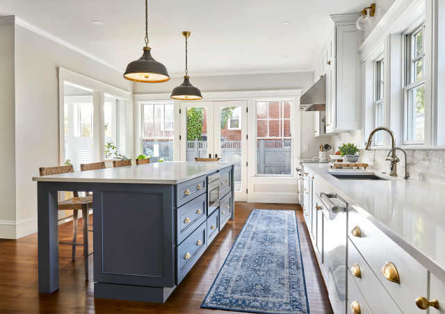


Built in the 1920s, this Colonial Revival home in Providence, Rhode Island, was rich with period character, including Craftsman-style detailing. But the kitchen didn’t share in that charm. Small and inefficient, it fell short for a family with two young daughters. Looking for a space that better supported everyday life, the homeowners hired Jonathan Chambers Architects, Wescott Building & Remodeling and Three Sparrows Interior Design to create an addition that would expand the kitchen and make it more family-friendly.

To integrate the addition, the remodeling team took the existing kitchen down to the studs for a full overhaul. Interior designer Nicole Martel worked closely with the couple to develop a layout tailored to how they wanted to use the space and choose finishes that felt appropriate for the home’s period architecture. The new kitchen features an island large enough to seat the whole family, a second oven for holiday cooking and a walk-in pantry concealed behind false cabinet doors.


This article was originally published by a www.houzz.com . Read the Original article here. .


Four Brothers Design + BuildSave Photo
Photos by Steve Hershberger

Bathroom at a Glance
Who lives here: A couple with kids at home and away at college
Location: Great Falls, Virginia
Size: 170 square feet (16 square meters)
Designer: Iva Saller of Four Brothers Design + Build

During the design phase of the project, the homeowners worked remotely with Saller. They flew in regularly for in-person meetings, while others were virtual. Saller mailed them samples when they couldn’t make it to see them in person. For important decisions like the countertop stone, they came back and visited the stone yard to pick their slabs. One of the reasons they were moving back was to be near family, so the design trips also doubled as family visits.

The primary bathroom is part of the new addition off the back of the home. “The site is very private, located off a winding gravel road,” Saller says. “There’s a steep grade change from the front of the house to the back, and all they see from the windows is the forest. Feeling open to nature was important to them.”

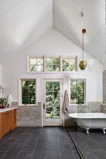
Including lots of windows and the glass door in the bathroom opens it up to the views and brings in light. The door leads to a covered balcony. The roof extension over the balcony protects the room from direct sunlight and offers protection from the elements when the homeowners want to step out for some fresh air.

Paint colors: White Opulence (walls) and Chantilly Lace (trim), Benjamin Moore

Find a local design-build firm on Houzz


This article was originally published by a
www.houzz.com . Read the Original article here. .


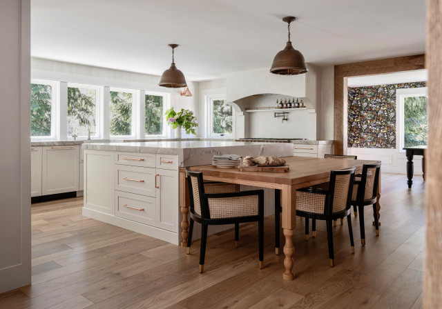
This Seattle-area family enjoyed daily casual meals and cooking together. But as the family grew to six, the kitchen seemed to be bursting at the seams. So the homeowners hired interior designer Harmony Weihs to figure out how to enlarge their kitchen, update other spaces and improve the flow throughout their home. Weihs proposed an addition that would double the size of the kitchen and extend the dining room a few feet to accommodate more family members when they gather.

Beyond the space planning, she helped the owners balance the light-filled kitchen they craved with the cozy cottage feel they love. Within the mostly white palette, she added copper accents, a large blue range, a limestone plaster vent hood, wood beams and honed countertops to create a more casual, European-inspired vibe in the room.


This article was originally published by a www.houzz.com . Read the Original article here. .


This 1920s Spanish Colonial home in Kensington, California, has quite a history, including being the residence of J. Robert Oppenheimer during his time at the University of California, Berkeley. However, the home’s funky kitchen didn’t share that history; it was added on to the back of the home in the 1970s. The homeowner, who loves to cook and to host her grandchildren, looked to Houzz to find a designer when she was ready to remodel. She found interior designer Anne Norton, who came up with a design that would lighten the space and tie it in with the rest of the historic architecture.

AND Interior Design StudioSave Photo
Photos by Peter Lyons Photography

Kitchen at a Glance
Who lives here: A woman and her dog, Teddy
Location: Kensington, California
Size: 252 square feet (23 square meters)
Designer: Anne Norton of AND Interior Design Studio

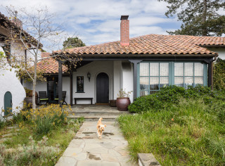
Before we step inside, take a look at this photo, which shows the home’s classic 1920s Spanish Colonial architecture. It also introduces us to the homeowner’s dog, Teddy.

The homeowner wanted her kitchen to flow with the rest of the home’s historic architecture. “She’s a big cook, she even likes to make her own yogurt and kombucha,” Norton says. She also loves to gather around the kitchen table with friends and family, especially her grandchildren.

Find a local interior designer on Houzz

AND Interior Design StudioSave Photo
Here’s a peek at the kitchen in the background, beyond the dining room. The arched opening in the foreground is an architectural element that’s repeated throughout the home. The existing opening to the kitchen had been squared off. Norton redesigned the opening, giving it a graceful arch that mimics the others in the house.

The dining room and the other original rooms had high ceilings. But the kitchen addition had a low, flat ceiling covered in dark wood.

Shop for a chandelier

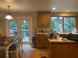
Before: “The kitchen had a much different look than the rest of the house,” Norton says. “It had been strongly influenced by the School of Environmental Design at UC Berkeley in the ’70s. It was very dark, it had post-and-beam architecture, and it had a flat, low, wood-covered ceiling.” You can glimpse the squared-off opening to the dining room at left.

The cabinets were dark-stained Douglas fir, the wood on the ceiling had a dark stain, and the floors were dark. “The layout was good but there wasn’t enough storage,” Norton says. “We also wanted to upgrade the cabinetry with doors and drawers that were easy to open. The goal was to modernize the kitchen while making it feel like it was part of the original architecture.”

AND Interior Design StudioSave Photo
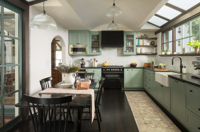
After: While Norton kept the addition’s original footprint and its windows and skylights intact, she looked to the ceiling to help her tie the space to the rest of the home. First she turned to a structural engineer to help remove the post-and-beam structure. Two new large steel beams were installed to hold up the roof. This allowed the designer to raise the ceiling to 9½ feet at the highest point and add a curve to it that was inspired by the arches in the rest of the home. “Raising and curving the ceiling was the most important thing we did,” Norton says. She centered the range and vent hood on the curve. The refrigerator is located at the end of the cabinet run on the right.

With the other elements in the kitchen lightened up, Norton kept the dark floors. “I am a big believer in ‘If it ain’t broke, don’t fix it,’” she says. A Middle Eastern rug adds lightness. “I like the way the soft pale oranges in the rug juxtapose with the green cabinets,” Norton says. “It brings a lot of dynamism to the space.”

Browse dining tables in the Houzz Shop

AND Interior Design StudioSave Photo
Another important element that ties the kitchen to the rest of the home is the hand-plastered finish on the walls. “We kept the materials in the kitchen simple and honest to let the architecture of the curved ceiling bring the drama,” Norton says. This includes the soft sage green on the cabinets, leathered Absolute Black granite counters and marble subway tiles.

The cabinet profiles are flush inset with simple lines and hardware. And they’re also modern, with lots of inserts and features like spice pullouts, a panel-front dishwasher and trash-recycling pullouts. They have full-extension door and drawer slides, meaning they extend out from the cabinet the full length of the slide when opened, not the typical 75%.

Norton chose Benjamin Moore’s Carolina Gull paint for the cabinets, bringing in a soft, nature-inspired color. The hardware is oil-rubbed bronze. “It will patina over time,” Norton says. This will lend a sense of age that matches other details in the home.

Find a local cabinet pro

AND Interior Design StudioSave Photo
The Douglas fir windows were a part of the 1970s addition, so Norton added Douglas fir shelves to tie in with them. She notes that being thoughtful about small details was important. “We didn’t float the shelves,” she says. “The little supports that hold up the shelves are an old-world technique. I think it’s these small details that make the kitchen feel authentic.”

The cabinets on either side of the vent hood have decorative metal mesh inserts that give them a lighter feel. Also, Norton had the marble backsplash tiles hand-cut into 4-by-8-inch rectangles. This gives them a stronger presence than if standard 3-by-6-inch tiles had been used.

AND Interior Design StudioSave Photo
This homeowner is a staunch kitchen table person, and the existing expanse of windows provided the perfect spot for one. The table is a Scandinavian piece from the 1800s. The built-in china cabinets to the left are original to the addition and worked well with the renovated kitchen’s architecture.

Norton wanted to create just the right spot for the homeowner’s Keith Haring subway art. “That wall where the art hangs was a wood grid of 12-by-12-inch cubbies that made no sense, so we took them out,” she says. She replaced them with a plastered wall that lightened the room and gave the owner a spot to hang the beloved artwork.

The large windows overlooking the back garden were a great feature of the 1970s addition. “There is a view of wisteria hanging from a trellis, and her chickens come up and look through the windows. I always leave this house loaded up with a dozen eggs,” Norton says with a laugh.

AND Interior Design StudioSave Photo


This article was originally published by a
www.houzz.com . Read the Original article here. .
Pin It