
Built in the 1920s, this Colonial Revival home in Providence, Rhode Island, was rich with period character, including Craftsman-style detailing. But the kitchen didn’t share in that charm. Small and inefficient, it fell short for a family with two young daughters. Looking for a space that better supported everyday life, the homeowners hired Jonathan Chambers Architects, Wescott Building & Remodeling and Three Sparrows Interior Design to create an addition that would expand the kitchen and make it more family-friendly.
To integrate the addition, the remodeling team took the existing kitchen down to the studs for a full overhaul. Interior designer Nicole Martel worked closely with the couple to develop a layout tailored to how they wanted to use the space and choose finishes that felt appropriate for the home’s period architecture. The new kitchen features an island large enough to seat the whole family, a second oven for holiday cooking and a walk-in pantry concealed behind false cabinet doors.
This article was originally published by a www.houzz.com . Read the Original article here. .


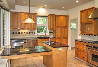
Kitchen at a Glance
Who lives here: A couple
Location: South Minneapolis, Minnesota
Size: 225 square feet (21 square meters)
Design-build firm: Bluestem Remodeling
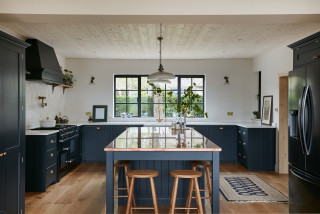
The kitchen features custom Shaker-style cabinets in a mix of black and wood units. Polished gold-tone knobs and pulls add refined accents. “The clients were really interested in not having a monolithic look with their cabinetry,” says Mark Ferraro-Hauck, director of design at Bluestem Remodeling. “I love the repeated black throughout the room, but it’s not a black kitchen.”
Wide-plank white oak flooring has a special sealer that preserves its natural, unfinished appearance. “It integrates really well with the rest of the house, giving it a consistent flow,” Ferraro-Hauck says. “We didn’t want the kitchen to feel completely separate from the rest of the house.”
A large sliding glass door opens the kitchen to the patio and backyard. “Their backyard is their summer living room,” Ferraro-Hauck says. A double-hung window on the same wall adds another source of daylight and fresh air.
Custom cabinetry: Sean’s Cabinetry
Find kitchen remodelers on Houzz